Perception
Before digging into visualizations, we must understand how do we perceive images. We will first give an overview about how eye perceives light, we will then take a look at the role of attention in vision.
The human eye
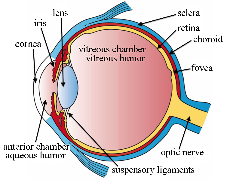
Typically the human eye can detect light in the range of wavelengths going from 380 nanometers (violet) to 700 nanometers (red). Our eye is rather complex, but to our aim we can only consider few components:
- The cornea which acts as a convergent lens and focuses the light coming to our eye.
- The iris which regulates the amount of light entering into our eye.
- The crystalline lens changes the focal length of the eye, allowing us to focus on different objects.
- The retina which contains the light receptors of our eye.
- The optic nerve which transmits the information from the retina to the brain.

The light receptors are located on the retina, and they convert the light into electric signals.
These electric signals are then sent to the brain through the optic nerve.
In order to accommodate the optic nerve, there is a hole into our retina, and this implies that we have a blind spot into our sight.
If you want to experiment it yourself, you can close your right eye and look at the right circle, making sure that the two circles are
aligned and that the line is in front of your nose. Move your head closer and farther away from the screen, at some point you should see the left circle disappearing.
The exact distance depends on the dimension of your screen, but on a PC screen this should happen roughly at a distance equal to your
arm’s length.
If you tried the experiment, you will notice that you simply don’s see the black circle, but you perceive
that you see the background color.
This happens because our brain keeps reconstructing the unavailable information with the available information.
Into the retina we have three kind of receptors:
- The rod cells which are very sensitive in low light conditions. They are roughly 90 millions and are especially used into the peripheral vision and night vision. They are especially concentrated at the outer edge of our retina
- The cone cells are responsible of the color vision, and are roughly 6 millions. Human eye has three kind of cone cells, and each type is more sensitive into a specific wavelengths range, corresponding approximately to red, blue and green wavelengths and named long, medium and short wavelengths cones.
- The retinal ganglion cells, which are devoted to long term representation of ambient light, and are very important for many tasks such as the pupil control, the melatonin production and in the synchronization of the circadian rhythm.
The red cones are approximately ten times the green or blue ones, this is why we are better in discriminating the red tones than the blue or green ones.

The cone density is much higher in a small region located oppositely to the iris, namely the fovea. Approximately half the nerve fibers in the optic nerve carry information from the fovea, while the remaining half carry information from the rest of the retina.
This should suggest you that the fovea is the region with the highest resolution of the retina, and since it is very small our eye can only clearly see within a very small region. In fact, our high-resolution region is limited to less than 2 degrees. If you want to visualize this angle, you can use the thumb’s rule: extend your arm in front of you and look at your thumb, its width has a visual angle of approximately 2 degrees.
On the other hand, on average, we have the feeling that we can clearly see most of what surrounds us. This is because our eye makes small movements (typically less than 20 degrees) named saccadic movements with an average time between two movements of 225 ms. Our brain then elaborates the images and reconstructs a map by using many movements, giving us the feeling of a higher resolution.
This has a very important impact on data visualization:
Preattentive features
For this reason the scientific community spent a lot of energy in trying and determine what drives our attention. According to Colin Ware’s textbooks Information Visualization: Perception for Design the list of features which drives our attention, named preattentive features, can be divided into four kind of features: form, color, motion and spatial positioning.
Form:
- Line orientation
- Line length
- Line width
- Line collinearity
- Size
- Curvature
- Spatial grouping
- Blur
- Added marks
- Numerosity
Color:
- Color hue
- Color intensity
Motion:
- Flicker
- Direction of motion
Spatial positioning:
- 2D position
- Stereoscopic depth
- Convex/concave shape from shading
Not all of them take the same amount of time to be processed. As an example, it takes a very short time to recognize a red circle between many blue circles. If you don’t trust me you can try and click on the red circle in the figure below. Each time you will hit it a new figure will appear, and you will get visualize the distribution of the time needed to hit it.
I am quite sure it was quite an easy task, as most of us can clearly see the red circle immediately. For this reason we say that the red circle pops out. You can now try and perform the same task, but this time you will be required and hit the blue square.
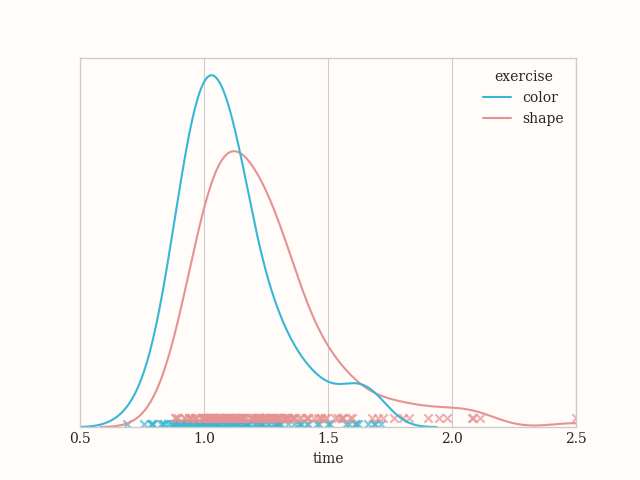
I am quite sure it was quite easy, but not as easy as the exercise before. Now try and compare your time distributions. Is the first one typically smaller than the second one? Do the two distributions overlap? Here you can find the kernel density estimate for my results, which I collected for few days, trying the exercises in different moments and in different order.

The heavy tails likely correspond to some missed click, so it took some time to click a second time. The two distributions are similar but definitely not identical, the one corresponding to the shape is shifted on the right with respect to the one corresponding to the color.
Of course this cannot be considered an experiment, I am just trying and give you some evidence that finding a blue square between many blue circles takes some more time than finding a red circle between many blue circles.
Conclusions
We had a broad overview about how do we perceive what surrounds us, and we have seen that there is a class of visual features, namely the preattentive features, which govern our attention. We can leverage them to draw the attention of our audience where we think it’s most relevant
Unfortunately, as we will see, properly using the preattentive features is far from being easy, especially when you want to combine more than one feature. Some feature combinations are still preattentive, while other are no more preattentive, and at the best of my knowledge there are no exhaustive studies where these combinations are analyzed.
For this post we will limit our discussion about one feature at time, but we will discuss how we can combine more than one feature to obtain different effects.
Bonus: the results of your tests
In the following are listed the results of both of your test.
Color difference
Size difference
Suggested readings
- Ware, C. (2013). Information Visualization: Perception for Design. Netherlands: Elsevier Science.
