
Completely randomized design
This time we will take a look at the simplest, and probably the most important experiment design, that is the completely randomized design. We will start by planning the data collection, and we will go through the entire analysis process.
Finding the fastest algorithm
This time we will try and apply the DOE principles to the task of searching the faster linear algorithm, as well as to assess the speed difference. We will consider four scikit-learn algorithms: the linear regression, the Ridge regression, the cross-validated ridge regression and the elastic networks. We will perform the fit for each algorithm 60 times, and we will measure the execution time of each run. We will randomize the execution order, and this should help us in removing the bias due to cache-cleaning processes after the previous fit as well as the one due to external background process. In order to further reduce the first bias, we will wait a random time between each process and the next one. This has been implemented in a python script as follows:
import random
import time
import pandas as pd
import numpy as np
from ucimlrepo import fetch_ucirepo
from sklearn.linear_model import ElasticNet, LinearRegression, Ridge, RidgeCV

dataset = fetch_ucirepo(id=1)

Xs = dataset.data.features
X = Xs
dummies = pd.get_dummies(Xs['Sex'])
X.drop(columns='Sex', inplace=True)

X = pd.concat([X, dummies], axis=1)
ys = dataset.data.targets.values.ravel()

algo_list = [ElasticNet, LinearRegression, Ridge, RidgeCV]*60
random.shuffle(algo_list)


print("Id,Algorithm,Start,Time")
for k, algorithm in enumerate(algo_list):
    algo = algorithm()

    slp = np.random.uniform(low=0.05, high=0.1)
    time.sleep(slp)
    start = time.perf_counter()

    algo.fit(X, ys)

    end = time.perf_counter()
    print(f"{k},{str(algorithm).split('.')[-1].split("'")[0]},{start},{end - start}")
After storing the output in a csv file, we can easily analyze it.
import pandas as pd
import pymc as pm
import arviz as az
import numpy as np
import seaborn as sns
from matplotlib import pyplot as plt
from scipy.stats import probplot

rng = np.random.default_rng(42)

draws = 2000
tune = 2000

df = pd.read_csv('out_test.csv')

df.sort_values(by='Algorithm', inplace=True, ascending=False)

df.head()
| Id | Algorithm | Start | Time | |
|---|---|---|---|---|
| 120 | 120 | RidgeCV | 207.158 | 0.0031665 |
| 140 | 140 | RidgeCV | 208.755 | 0.00335872 |
| 175 | 175 | RidgeCV | 211.442 | 0.00320612 |
| 177 | 177 | RidgeCV | 211.593 | 0.00341314 |
| 179 | 179 | RidgeCV | 211.754 | 0.00313911 |
It is however suitable some data-preprocessing and some exploratory data analysis, this is in fact what happens if we immediately fit our data with the textbook model using some weakly-informative prior:
df['Algorithm']=pd.Categorical(df['Algorithm'])

coords={'cat': pd.Categorical(df['Algorithm']).categories, 'obs': range(len(df))}

with pm.Model(coords=coords) as start_model:
    mu = pm.Normal('mu', mu=0, sigma=10, dims=('cat'))
    sigma = pm.HalfCauchy('sigma', 10)
    y = pm.Normal('y', mu=mu[df['Algorithm'].cat.codes], sigma=sigma, observed=df['Time'], dims=('obs'))

with start_model:
    idata_start = pm.sample(nuts_sampler='numpyro',
                            draws=draws, tune=tune, chains=4, random_seed=rng)

az.plot_trace(idata_start)
fig = plt.gcf()
fig.tight_layout()
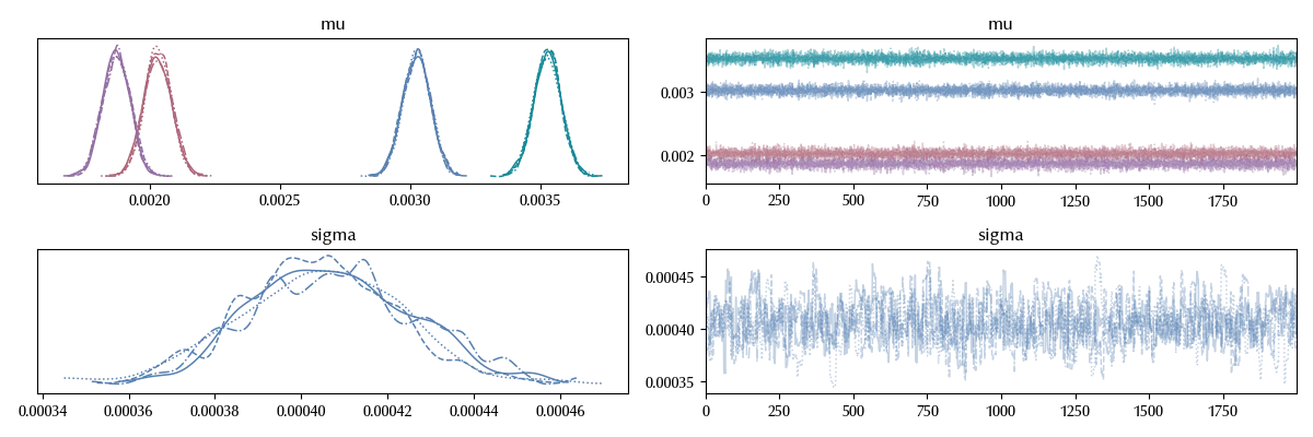
Our trace doesn’t look great, since our sampling for sigma is too wiggly and the four trace are one different from the other ones.
The issue is originated by the fact that our model is not really appropriate for the data
with start_model:
    idata_start.extend(pm.sample_posterior_predictive(idata_start))

fig, ax = plt.subplots(nrows=2, ncols=2)
for k, elem in enumerate(algs):
    i = k % 2
    j = k // 2
    sns.histplot(idata_start.posterior_predictive['y'].sel(obs=range(k*60, (k+1)*60)).values.reshape(-1), ax=ax[i][j], stat='density')
    sns.histplot(df[df['Algorithm']==algs[k]]['Time'], ax=ax[i][j], stat='density')
    ax[i][j].set_title(elem)
fig.tight_layout()
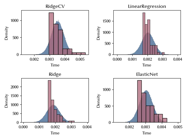
Let us now try and understand what’s missing, and how to fix it.
Data preparation
Let us now start and look at the data, in order to improve the sampling.
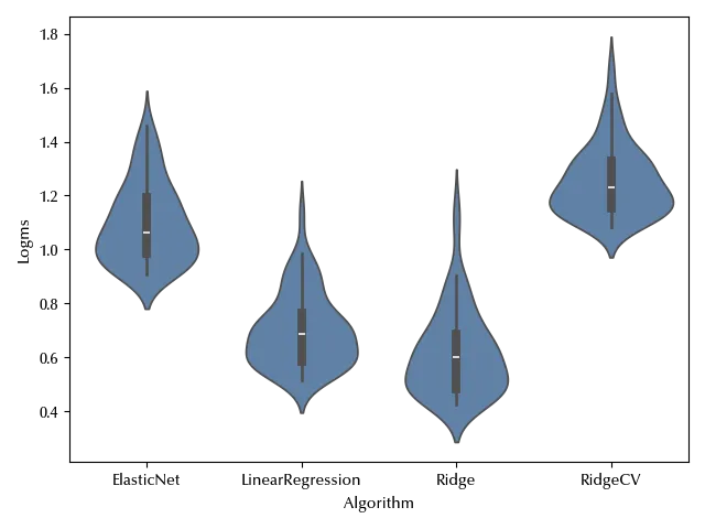
First of all, the order of magnitude of the data is $10^{-3}$, and this might cause some problem in the sampling. It is always better to have properly scaled data, so let us simply transform the time in milliseconds.
df['msec'] = 1000 * df['Time']
This is however not the only issue. We are assuming a normal likelihood, and the normal distribution is symmetric around the mean. The observed data on the other hand looks quite skewed, and this might affect the quality of our fit. This is not a problem by itself, but it’s an undesired thing because a higher uncertainty in the fit could give us a higher uncertainty in the estimate of the means, and since we want to assess the difference of the average performances of the algorithms, this might be a problem.
Since we are dealing with skewed data, we have two possible ways: transform the data or change the likelihood. Since we are dealing with positive data, we might fit the logarithm of the time or its square root. Assuming a log-normal distribution would be equivalent to log-transform the data from a model point of view. Let us try and log-transform the data:
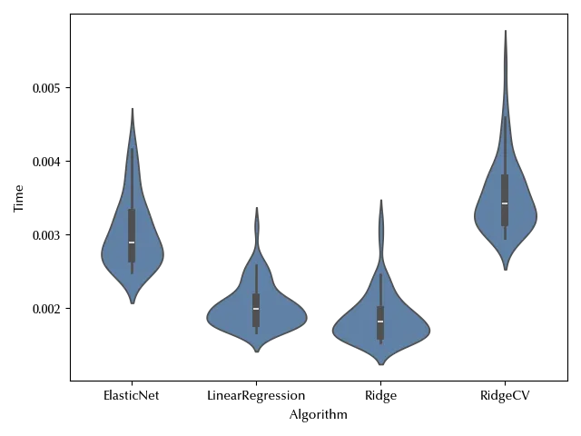
df['Logms'] = np.log(df['msec'])

fig, ax = plt.subplots()
sns.violinplot(df, y='Logms', x='Algorithm', ax=ax)
fig.tight_layout()
The observed data is not as skewed as before. Let us use a pp-plot to check if the normality assumption looks reasonable.
fig, ax = plt.subplots(nrows=2, ncols=2)
for k, algo in enumerate(df['Algorithm'].drop_duplicates()):
    i = k // 2
    j = k % 2
    df_red = df[df['Algorithm']==algo]
    probplot(df_red['Logms'], plot=ax[i][j])
    ax[i][j].set_title(algo)
fig.tight_layout()
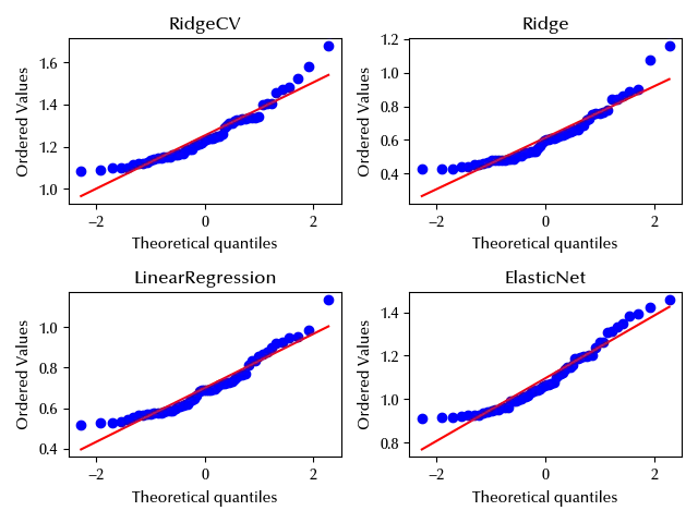
While close to the mean the data seems to agree with the normal distribution, it looks like there departure from normality is quite important far away from the center of the distribution. We could handle this issue by switching to a more robust distribution, and in this way the heavy (right) tail should not have a large impact on the mean estimate.
Since switching to the log-normal distribution would make it difficult to handle this aspect of the data, we will first log-transform the data and then use a Student-t likelihood. Let us see how does our model performs.
The updated model
We again will use weakly-informative priors for all the parameters.
with pm.Model(coords=coords) as model:
    mu = pm.Normal('mu', mu=0, sigma=5, dims=('cat'))
    sigma = pm.HalfCauchy('sigma', 10)
    nu = pm.HalfNormal('nu', 10)
    y = pm.StudentT('y', mu=mu[df['Algorithm'].cat.codes], sigma=sigma,
                    nu=nu, observed=df['Logms'], dims=('obs'))

with model:
    idata = pm.sample(nuts_sampler='numpyro',
                      draws=draws, tune=tune, chains=4, random_seed=rng)

az.plot_trace(idata)
fig = plt.gcf()
fig.tight_layout()

The traces look much better, and our estimate for the means are more precise than with the previous model. Let us see if there’s an improvement in the posterior predictive distribution
fig, ax = plt.subplots(nrows=2, ncols=2)
for k, elem in enumerate(algs):
    i = k % 2
    j = k // 2
    sns.histplot(idata.posterior_predictive['y'].sel(obs=range(k*60, (k+1)*60)).values.reshape(-1), ax=ax[i][j], stat='density')
    sns.histplot(df[df['Algorithm']==algs[k]]['Logms'], ax=ax[i][j], stat='density')
    ax[i][j].set_title(elem)
fig.tight_layout()
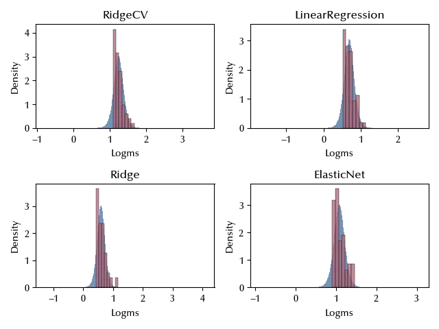
The fit seems highly improved, but it looks like we are still missing a threshold effect. This should however not be a big issue until our aim is to compare the means of the model’s training time. Let us also take a look at the LOO-PIT distribution
with model:
    pm.compute_log_likelihood(idata)

fig, ax = plt.subplots(nrows=2)
az.plot_loo_pit(idata, y='y', ax=ax[0])
az.plot_loo_pit(idata, y='y', ecdf=True, ax=ax[1])
fig.tight_layout()

It still looks like we are still missing something in the description of our data, but for our purpose the description is sufficiently good, and we will not invest time into a better description of our data.
A better parametrization
We can however improve our model’s interpretability. Since we are interested into the difference in the performances of the different models, using the mean as parameter does not make much sense. Let us use the fastest algorithm (the Ridge regression model) as benchmark and let us use the difference with its mean as parameter.
df_algo =  np.argsort(df.groupby('Algorithm').mean()['Time']).reset_index()

df_algo=df_algo.rename(columns={'Time': 'Num'})

df_new = pd.merge(df, df_algo, left_on='Algorithm', right_on='Algorithm', how='left')

df_algo = df_algo.sort_values(by='Num', ascending=True)

X = pd.get_dummies(df_new['Num'], drop_first=True).astype(int)

X.columns = df_algo['Algorithm'].values[1:]

X.head()
| LinearRegression | ElasticNet | RidgeCV | |
|---|---|---|---|
| 0 | 0 | 0 | 1 |
| 1 | 0 | 0 | 1 |
| 2 | 0 | 0 | 1 |
| 3 | 0 | 0 | 1 |
| 4 | 0 | 0 | 1 |
with pm.Model(coords={'algo': X.columns, 'obs': range(len(df))}) as comp_model:
    alpha = pm.Normal('alpha', mu=0, sigma=5)
    beta = pm.Normal('beta', mu=0, sigma=1, dims=('algo'))
    mu = alpha + pm.math.dot(beta, X.T)
    sigma = pm.HalfCauchy('sigma', 10)
    nu = pm.HalfNormal('nu', 10)
    y = pm.StudentT('y', mu=mu, sigma=sigma, nu=nu, observed=df['Logms'], dims=('obs'))

with comp_model:
    idata_comp = pm.sample(nuts_sampler='numpyro',
                           draws=draws, tune=tune, chains=4, random_seed=rng)

az.plot_trace(idata_comp)
fig = plt.gcf()
fig.tight_layout()
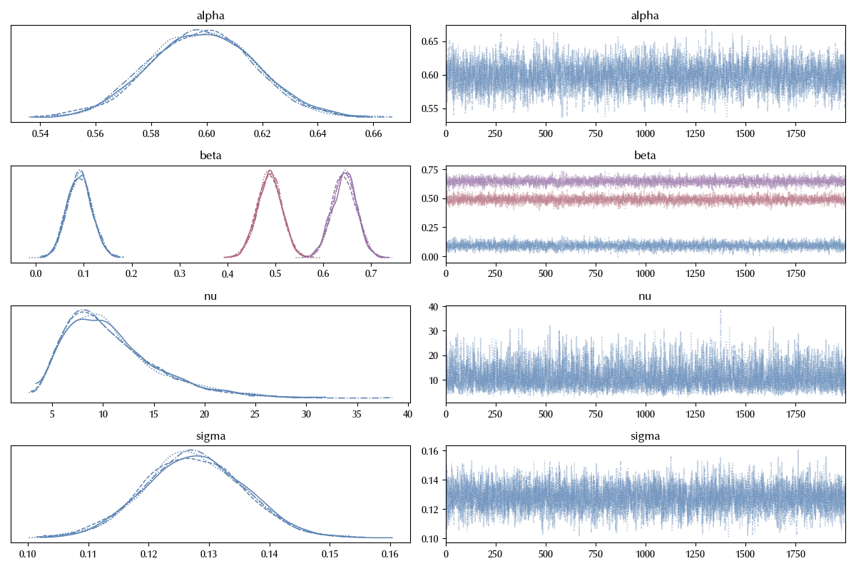
Also in this case the trace looks fine. We can now easily visualize the values for the $\beta$ parameters
az.plot_forest(idata_comp, var_names='beta')
fig = plt.gcf()
fig.tight_layout()
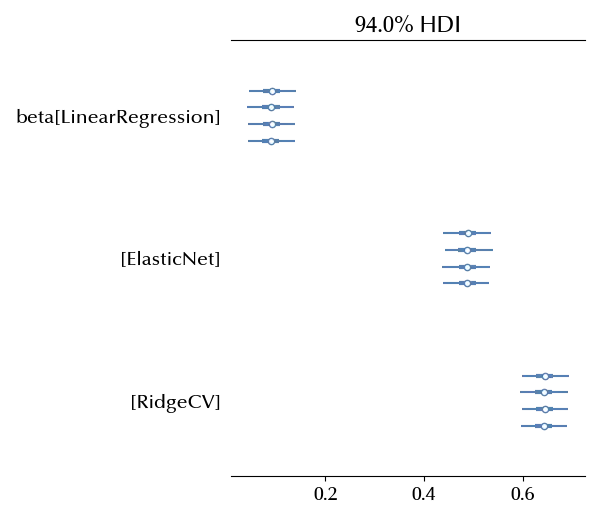
Since
\[\mathbb{E}[log(y_i^{Ridge})] = \alpha\] \[\mathbb{E}[log(y_i^{j})] = \alpha + \beta^j\]we have that $\alpha$ is the expected value for the logarithm of the time, expressed in milliseconds, for the Ridge regression algorithm. On the other hand, $\beta_{j}$ is the difference between the log-time of the corresponding algorithm and the log-time of the Ridge regression.
Conclusions
We discussed how to perform and analyze a simple completely randomized experiment, and we discussed some of the difficulties that may show up when fitting some unprocessed data. We have also seen some method to verify if our data conflicts with the model assumptions, and how to relax the model assumptions.
Suggested readings
- Lawson, J. (2014). Design and Analysis of Experiments with R. US: CRC Press.
- Hinkelmann, K., Kempthorne, O. (2008). Design and Analysis of Experiments Set. UK: Wiley.