
Difference in difference
Difference in differences is a very old technique, and one of the first applications of this method was done by John Snow, who’s also popular due to the cholera outbreak data visualization.
In his study, he used the Difference in Difference (DiD) method to provide some evidence that, during the London cholera epidemic of 1866, the cholera was caused by drinking from a water pump. This method has been more recently used by Card and Krueger in this work to analyze the causal relationship between minimum wage and employment. In 1992, the New Jersey increased the minimum wage from 4.25 dollars to 5.00 dollars. They compared the employment in Pennsylvania and New Jersey before and after the minimum wage increase to assess if it caused a decrease in the New Jersey occupation, as supply and demand theory would predict.
With DiD we assume that, before the intervention $I$, the untreated group and the treated one both evolve linearly with the time $t$ with the same slope, while after the intervention the treated group changes slope. Assuming that the intervention was applied at time $t=0$
\[\begin{align} & Y_{P}^0 = \alpha_{P} \\ & Y_{P}^1 = \alpha_{P} +\beta \\ & Y_{NJ}^0 = \alpha_{NJ} \\ & Y_{NJ}^1 = \alpha_{NJ} +\beta + \gamma \end{align}\]In the above formulas, the intervention effect is simply $\gamma\,.$
The implementation
We downloaded the dataset from this page.
import pandas as pd
import numpy as np
import pymc as pm
import bambi as pmb
import arviz as az
import seaborn as sns
from matplotlib import pyplot as plt
df_employment = pd.read_csv('data/employment.csv')
rng = np.random.default_rng(42)
kwargs = {'nuts_sampler': 'numpyro', 'random_seed': rng,
'draws': 5000, 'tune': 5000, 'chains': 4, 'target_accept': 0.9}
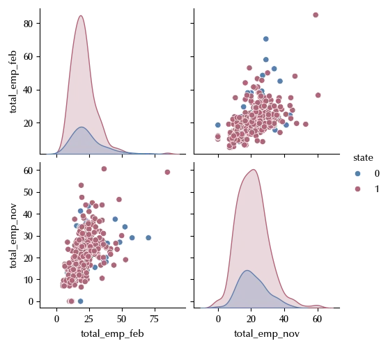
sns.pairplot(data=df_employment, hue='state')
df_before = df_employment[['state', 'total_emp_feb']]
df_after = df_employment[['state', 'total_emp_nov']]

# We will assign t=0 data before treatment and t=1 after the treatment
# Analogously g=0 will be the control group, g=1 will be the test group

df_before['t'] = 0
df_after['t'] = 1

df_before.rename(columns={'total_emp_feb': 'Y'}, inplace=True)
df_after.rename(columns={'total_emp_nov': 'Y'}, inplace=True)

df_before.rename(columns={'state': 'g'}, inplace=True)
df_after.rename(columns={'state': 'g'}, inplace=True)

df_reg = pd.concat([df_before, df_after])

df_reg = df_reg[['g', 't', 'Y']]

df_reg['id'] = np.arange(len(df_reg))

df_reg.set_index('id', inplace=True)

model = pmb.Model('Y ~ g*t', data=df_reg, family='t')

idata = model.fit(**kwargs)

az.plot_trace(idata
fig = plt.gcf()
fig.tight_layout()
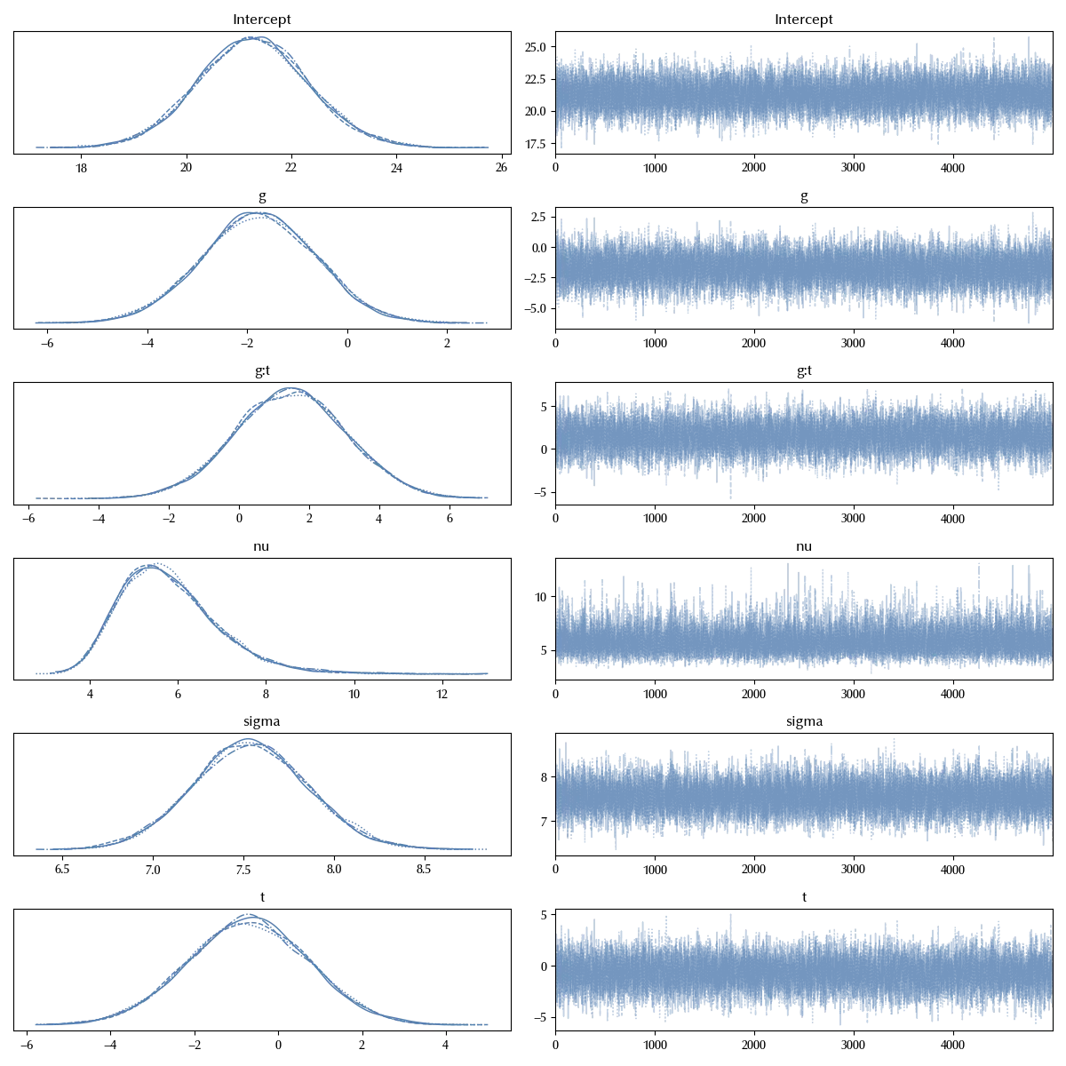
The trace looks fine, let us now verify the posterior predictive.
model.predict(idata=idata, data=df_reg, inplace=True, kind='response')

df_red = df_reg[['g', 't']].drop_duplicates().reset_index()


fig, ax = plt.subplots(figsize=(8, 6), nrows=2, ncols=2)
for k, elem in enumerate(df_red.iterrows()):
        idx = elem[1].id
        g = elem[1].g
        t = elem[1].t
        ax[g][t].set_xlim([-20, 80])
        for i in range(50):
            sns.kdeplot(az.extract(idata.posterior_predictive.sel(__obs__=idx), num_samples=100)['Y'], ax=ax[g][t],
                       color='lightgray')
        sns.kdeplot(az.extract(idata.posterior_predictive.sel(__obs__=idx))['Y'], ax=ax[g][t])
        sns.kdeplot(df_reg[(df_reg['g']==g)&(df_reg['t']==t)]['Y'], ax=ax[g][t], ls=':')
        ax[g][t].set_title(f"g={g}, t={t}")

legend = ax[0][0].legend(frameon=False)
fig.tight_layout()
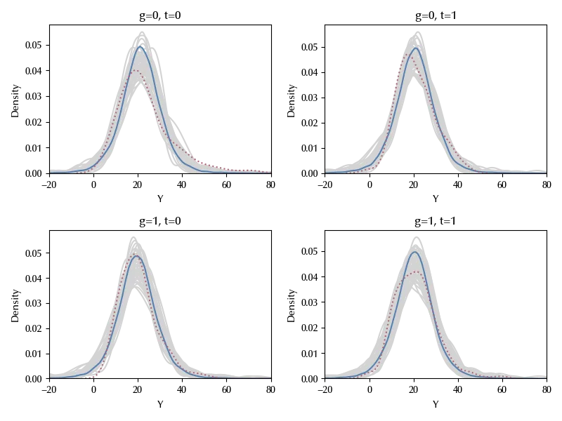
The posterior predictive distributions (solid blue) agree with the observed data (dashed red). We extracted some random sub-sample (grey) to provide an estimate of the uncertainties.
We can finally verify if there is any effect by plotting the posterior distribution of the interaction term:
az.plot_posterior(idata, var_names=['g:t'])
fig = plt.gcf()
fig.tight_layout()
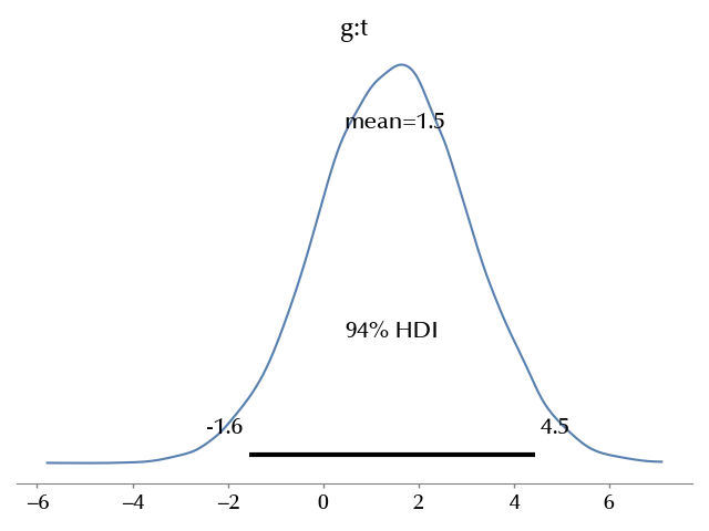
As you can see, the effect is compatible with 0, therefore there is no evidence that by increasing the minimum salary there is an effect on the occupation.
Our model has a small issue: it allows for negative values of the occupation, which doesn’t make sense. This problem can be easily circumvented by using the truncated PyMC class.
I suggest you to try it and verify yourself if there is any effect. Remember that in that case $\mu$ is no more the mean for $Y$, so you can’t use it to estimate the average effect.
Conclusions
We have seen how to implement the DiD method with PyMC, and we used to re-analyze the Krueger and Card article on the relation between the minimum salary and the occupation.
Suggested readings
- Imbens, G. W., Rubin, D. B. (2015). Causal Inference for Statistics, Social, and Biomedical Sciences: An Introduction. US: Cambridge University Press.
- Li, Ding, Mealli (2022). Bayesian Causal Inference: A Critical Review
- Ding, P. (2024). A First Course in Causal Inference. CRC Press.
- Angrist, J. D., Pischke, J. (2009). Mostly harmless econometrics : an empiricist’s companion. Princeton University Press.
%load_ext watermark
%watermark -n -u -v -iv -w -p xarray,numpyro,jax,jaxlib
Python implementation: CPython
Python version : 3.12.8
IPython version : 8.31.0
xarray : 2024.11.0
numpyro: 0.16.1
jax : 0.4.38
jaxlib : 0.4.38
matplotlib: 3.10.0
bambi : 0.15.0
seaborn : 0.13.2
numpy : 1.26.4
pandas : 2.2.3
arviz : 0.20.0
pymc : 5.19.1
Watermark: 2.5.0