
Robust linear regression
In some case your data may be not good enough to provide you reliable estimates with normal linear regression, and this is the case of the conclusions drawn from this article, where the author concludes that there is a significant correlation between the voter turnout in a country and its average income inequality. This example is a classical example of misleading result of a regression, where the author does not provide a plot of the data, taken from Healy, “Data visualization, a practical introduction”. The data below is extracted the data from the figure of Healy’s book. South Africa corresponds to the last point.
| turnout | inequality | |
|---|---|---|
| 0 | 0.85822 | 1.95745 |
| 1 | 0.837104 | 1.95745 |
| 2 | 0.822021 | 2.41135 |
| 3 | 0.87632 | 2.76596 |
| 4 | 0.901961 | 2.95035 |
| 5 | 0.776772 | 3.21986 |
| 6 | 0.72549 | 3.14894 |
| 7 | 0.72549 | 2.92199 |
| 8 | 0.61991 | 2.93617 |
| 9 | 0.574661 | 2.31206 |
| 10 | 0.880845 | 3.60284 |
| 11 | 0.803922 | 3.5461 |
| 12 | 0.778281 | 3.47518 |
| 13 | 0.739065 | 3.68794 |
| 14 | 0.819005 | 4.41135 |
| 15 | 0.645551 | 3.91489 |
| 16 | 0.669683 | 5.64539 |
| 17 | 0.14178 | 9.30496 |
import pandas as pd
import pymc as pm
import arviz as az
import numpy as np
import seaborn as sns
from matplotlib import pyplot as plt
import pymc.sampling_jax as pmjax

df_turnout = pd.read_csv('data/inequality.csv')
rng = np.random.default_rng(42)
sns.pairplot(df_turnout)
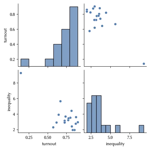
By simply plotting the data we can clearly see that there is one point, the South Africa, which is far away from the other, and this may have a huge impact on the fit. Let us see this, and how one may avoid this kind of error.
The normal linear regression
Let us start by assuming that the inequality is distributed according to a normal linear model, analogous to the one already discussed in the regression post.
\[Y \sim \mathcal{N}(\mu, \sigma)\]where
\[\mu = \alpha + \beta X\]We will assume that the precision $\tau = 1/\sigma$ is distributed according to a Half Normal distribution. Since the inequality goes from 0 to 10, assuming a standard deviation of $5$ for $\tau$ should be sufficient. On the other hand, we will make the quite generous assumption that
\[\alpha \sim \mathcal{N}(0, 20)\] \[\beta \sim \mathcal{N}(0, 20)\]with pm.Model() as model_norm:
alpha = pm.Normal('alpha', mu=0, sigma=20)
beta = pm.Normal('beta', mu=0, sigma=20)
tau = pm.HalfNormal('tau', sigma=5)
y = pm.Normal('y', mu=alpha+df_turnout['turnout'].values*beta, observed=df_turnout['inequality'].values, tau=tau)
with model_norm:
idata_norm = pm.sample(draws=4000, chains=4, tune=4000, nuts_sampler='numpyro',
idata_kwargs = {'log_likelihood': True}, random_seed=rng)
az.plot_trace(idata_norm)
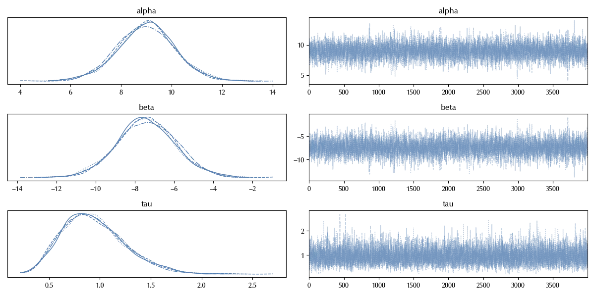
The trace doesn’t show any relevant issue, and for our purposes it is sufficient this check. Let us check our fit
x_plt = np.arange(0, 1, 0.001)

with model_norm:
    y_pred = pm.Normal('y_pred', mu=alpha+x_plt*beta, tau=tau)


with model_norm:
    idata_norm.extend(pm.sample_posterior_predictive(idata_norm, var_names=['y', 'y_pred'], random_seed=rng))


fig = plt.figure()
ax = fig.add_subplot(111)
ax.plot(x_plt, idata_norm.posterior_predictive['y_pred'].mean(dim=['draw', 'chain']))
ax.fill_between(x_plt, idata_norm.posterior_predictive['y_pred'].quantile(q=0.025, dim=['draw', 'chain']),
                idata_norm.posterior_predictive['y_pred'].quantile(q=0.975, dim=['draw', 'chain']), alpha=0.5, color='grey')
ax.scatter(df_turnout['turnout'].values, df_turnout['inequality'].values)
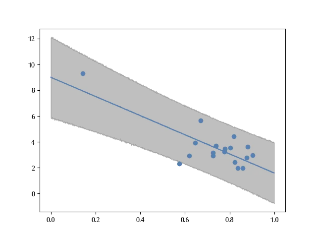
The error bands correctly reproduce almost all the data. However, since the South Africa is far away from the other countries, it may happen that its behavior strongly influences the fit.
Let us now use a more robust model. In order to make it more robust, which in this context means less sensitive to isolated data, let us take a t-Student likelihood instead of a normal one.
We will leave the parameters $\alpha\,, \beta$ and $\tau = \frac{1}{\sigma}$ unchanged, but we must choose a prior for the number of degrees of freedom $\nu\,.$
We want a robust estimate, so we want a prior with a small number of degrees of freedom. However, $\nu \approx 0$ can be hard to handle from a numeric perspective, since the resulting distribution decreases very slowly as one steps away from the peak. For the above reason, we choose a Gamma prior with $\alpha=4$ and $\beta=2\,.$
with pm.Model() as model_robust:
    alpha = pm.Normal('alpha', mu=0, sigma=20)
    beta = pm.Normal('beta', mu=0, sigma=20)
    tau = pm.HalfNormal('tau', sigma=5)
    nu = pm.Gamma('nu', alpha=4, beta=2)
    y = pm.StudentT('y', mu=alpha+df_turnout['turnout'].values*beta, observed=df_turnout['inequality'].values, sigma=1/tau, nu=nu)

with model_robust:
    idata_robust = pm.sample(draws=4000, chains=4, tune=4000,
                             idata_kwargs = {'log_likelihood': True},
                             nuts_sampler='numpyro', random_seed=rng)

az.plot_trace(idata_robust)
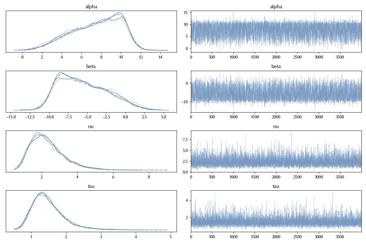
The trace doesn’t show relevant issues, so we can compute the posterior predictive.
with model_robust:
    y_pred = pm.StudentT('y_pred', mu=alpha+x_plt*beta, sigma=1/tau, nu=nu)

with model_robust:
    idata_robust.extend(pm.sample_posterior_predictive(idata_robust, var_names=['y', 'y_pred'], random_seed=rng))


fig = plt.figure()
ax = fig.add_subplot(111)
ax.plot(x_plt, idata_robust.posterior_predictive['y_pred'].median(dim=['draw', 'chain']))
ax.fill_between(x_plt, idata_robust.posterior_predictive['y_pred'].quantile(q=0.025, dim=['draw', 'chain']),
                idata_robust.posterior_predictive['y_pred'].quantile(q=0.975, dim=['draw', 'chain']), alpha=0.5, color='grey')
ax.scatter(df_turnout['turnout'].values, df_turnout['inequality'].values)
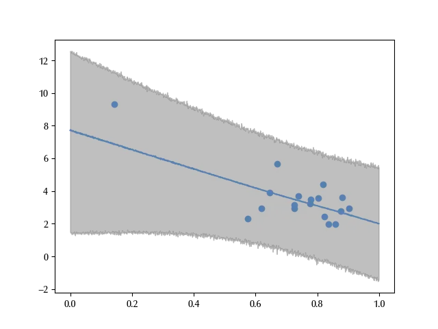
This distribution does a better job in reproducing the data, but it tells a very different story from the normal model.
While in fact in the above model an increase of the turnout translated into a reduction of the average inequality, with this robust model this conclusion does not appear so clearly.
Let us try and see what does the LOO can tell us.
df_compare = az.compare({'Normal model': idata_norm, 'Robust model': idata_robust})

az.plot_compare(df_compare)

The LOO is slightly better for the normal model, they are however very similar. Let us try and understand why.
df_compare
| rank | elpd_loo | p_loo | elpd_diff | weight | se | dse | warning | scale | |
|---|---|---|---|---|---|---|---|---|---|
| Normal model | 0 | -30.9967 | 4.92972 | 0 | 0.889385 | 4.39811 | 0 | True | log |
| Robust model | 1 | -32.3574 | 6.88334 | 1.36077 | 0.110615 | 4.66233 | 1.855 | False | log |
The difference is $1.65\,,$ and the difference due to the number of the degrees of freedom is the difference of the $p_{loo}\,,$ which is approximately 2.2, so the entire preference is due to the lower number of degrees of freedom of the normal distribution.
We can see, however, that the LOO estimate for the normal model has a warning. This generally happens because the ELPD estimate is not exact, and it’s only reliable when removing one point does not affect too much log predictive density.
loo_normal = az.loo(idata_norm)

loo_normal
Estimate SE
elpd_loo -31.00 4.40
p_loo 4.93 -
There has been a warning during the calculation. Please check the results.
------
Pareto k diagnostic values:
Count Pct.
(-Inf, 0.5] (good) 16 88.9%
(0.5, 0.7] (ok) 1 5.6%
(0.7, 1] (bad) 0 0.0%
(1, Inf) (very bad) 1 5.6%
There are two points which strongly affect our parameters, and one reasonable assumption is that one of those is the South Africa.
Let us try and see what does it happen once we remove it.
with pm.Model() as model_norm_red:
    alpha = pm.Normal('alpha', mu=0, sigma=20)
    beta = pm.Normal('beta', mu=0, sigma=20)
    tau = pm.HalfNormal('tau', sigma=5)
    y = pm.Normal('y', mu=alpha+df_turnout['turnout'].values[:17]*beta, observed=df_turnout['inequality'].values[:17], tau=tau)

with model_norm_red:
    idata_norm_red = pm.sample(draws=2000, chains=4, tune=2000,
                               idata_kwargs = {'log_likelihood': True},
                               nuts_sampler='numpyro',
                               random_seed=rng)

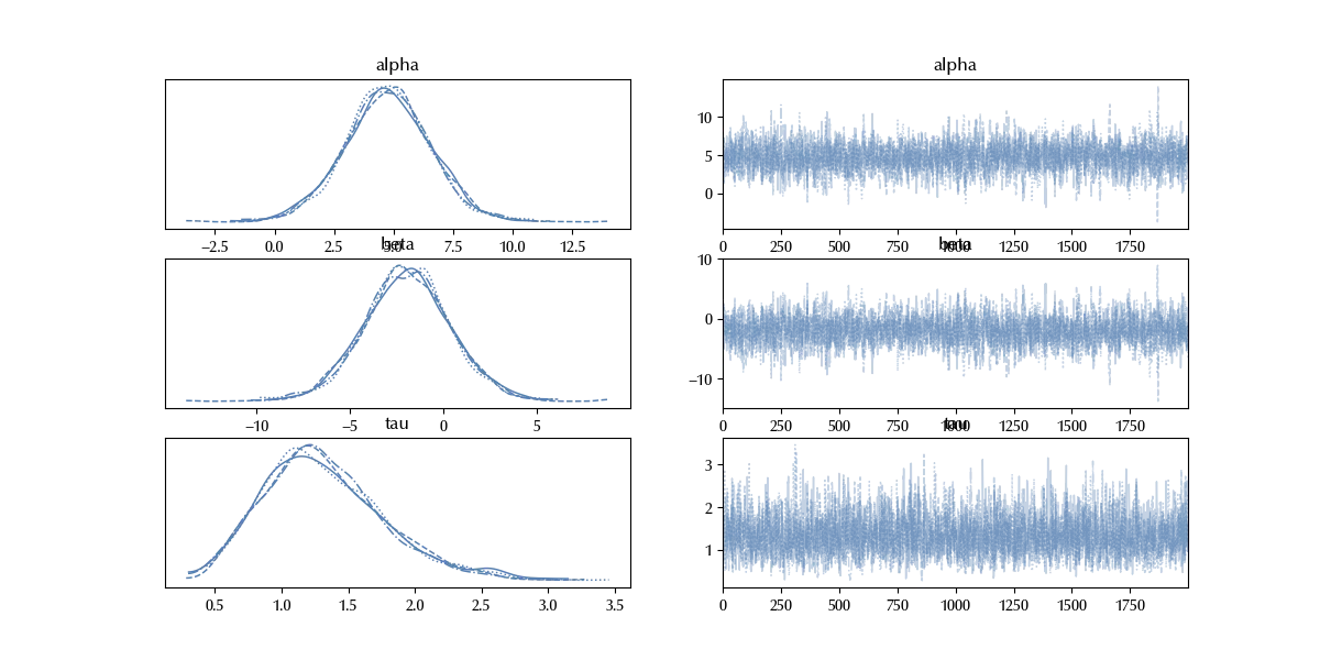
az.plot_trace(idata_norm_red)
with model_norm_red:
    y_pred_red = pm.Normal('y_pred', mu=alpha+x_plt*beta, tau=tau)


with model_norm_red:
    idata_norm_red.extend(pm.sample_posterior_predictive(idata_norm_red, var_names=['y', 'y_pred'], random_seed=rng))

fig = plt.figure()
ax = fig.add_subplot(111)
ax.plot(x_plt, idata_norm_red.posterior_predictive['y_pred'].mean(dim=['draw', 'chain']))
ax.fill_between(x_plt, idata_norm_red.posterior_predictive['y_pred'].quantile(q=0.025, dim=['draw', 'chain']),
                idata_norm_red.posterior_predictive['y_pred'].quantile(q=0.975, dim=['draw', 'chain']), alpha=0.5, color='grey')
ax.scatter(df_turnout['turnout'].values, df_turnout['inequality'].values)
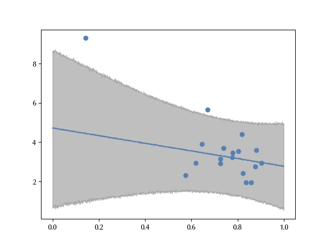
This result looks much more to the robust estimate than to the full normal estimate. While in the full normal model the parameter beta was not compatible with 0, both for the robust and for the reduced normal model it is. This implies that those models contradict the full normal model, which shows a negative association between the turnover and the average income inequality. Since the conclusion of the full normal model are heavily affected by the South Africa, before drawing any conclusion one should carefully assess whether it makes sense or not. Is the South Africa really representative or is it a special case?
Conclusions
We have discussed how to perform a robust linear regression, and we have shown with an example that using it instead of a normal linear regression makes our model more stable to the presence of non-representative items.
Suggested readings
- Healy, K. (2019). Data Visualization: A Practical Introduction. Princeton University Press.
%load_ext watermark
%watermark -n -u -v -iv -w -p xarray,pytensor
Python implementation: CPython
Python version : 3.12.7
IPython version : 8.24.0
xarray : 2024.9.0
pytensor: 2.25.5
pandas : 2.2.3
seaborn : 0.13.2
matplotlib: 3.9.2
pymc : 5.17.0
numpy : 1.26.4
arviz : 0.20.0
Watermark: 2.4.3
