
Multi-linear regression
When dealing with real-world datasets, you will often only have to deal with more than one independent variable. Here we will see how to adapt our framework to this case. As you will see, doing so is straightforward, at least in theory. In practice, this is not true, as deciding how to improve your model may be a tricky question, and only practice and domain knowledge will, sometimes, help you in this task.
The dataset
In this post, we will use the dataset provided in this very nice article, where the aim of the author is to show some of the difficulties one faces when dealing with real World datasets. The aim is to predict the price of a set of diamonds, given their carat numbers, their color, their clarity and their certification. I found this dataset in this amazing repo
import seaborn as sns
import pandas as pd
from matplotlib import pyplot as plt
import numpy as np
import pymc as pm
import arviz as az

df = pd.read_csv('https://vincentarelbundock.github.io/Rdatasets/csv/Ecdat/Diamond.csv')

df.head()
| rownames | carat | colour | clarity | certification | price | |
|---|---|---|---|---|---|---|
| 0 | 1 | 0.3 | D | VS2 | GIA | 1302 |
| 1 | 2 | 0.3 | E | VS1 | GIA | 1510 |
| 2 | 3 | 0.3 | G | VVS1 | GIA | 1510 |
| 3 | 4 | 0.3 | G | VS1 | GIA | 1260 |
| 4 | 5 | 0.31 | D | VS1 | GIA | 1641 |
It is known that white, clear diamonds look brighter, and because of this they have higher price than more opaque or colorful diamonds. When considering colour and clarity, one should however keep in mind that these values are assigned by experts, and two experts might provide different values for the same diamond.
Let us now take a look at the relation between carat and price.
sns.scatterplot(df, x='carat', y='price')
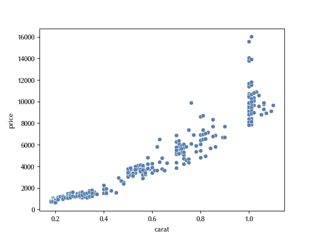
From the above figure, we can see that it is unlikely that a linear fit would work, since the dataset shows a very pronounced heteroskedasticity. In order to improve the homoscedasticity, we can try the following transformation
df['log_price'] = np.log(df['price'])
sns.scatterplot(df, x='carat', y='log_price')
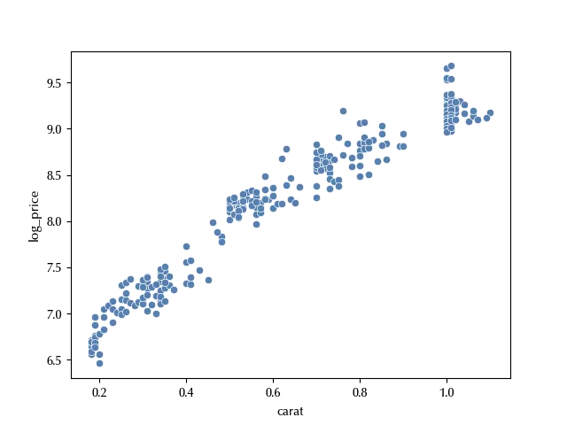
The above transformation improved the homoscedasticity, so we now have higher chances to be able to properly fit the dataset.
Let us now take a look at the categorical columns.
df.certification.drop_duplicates()
151 IGI
229 HRD
Name: certification, dtype: object
df.colour.drop_duplicates()
1 E
2 G
6 F
8 H
9 I
Name: colour, dtype: object
df.clarity.drop_duplicates()
1 VS1
2 VVS1
7 VVS2
83 IF
Name: clarity, dtype: object
These columns encode categories, and we should treat them by making an indicator variable for each possible value of the three variables.
Taking the color as an example, we will take one value as baseline (say “D”) such that all the indicator variables are zero for it. We will then define four indicator variables “E”, “F”, “G” and “H” with value 0 if the color is not the one corresponding to the variable, 1 otherwise. This can be easily done with pandas as follows:
df_col = pd.get_dummies(df['colour'], drop_first=True).astype(int)

df_clar = pd.get_dummies(df['clarity'], drop_first=True).astype(int)

df_cert = pd.get_dummies(df['certification'], drop_first=True).astype(int)

df_cat = pd.concat([df_col, df_clar, df_cert], axis=1)
We can now try and fit the data with a linear model. We will use two additional features which PyMC provides us, namely the “coords” option and the “Data” class.
coords = {'ind': df_cat.index, 'col': df_cat.columns}

yobs = df['log_price'].values

rng = np.random.default_rng(42)

with pm.Model(coords=coords) as model:
    alpha = pm.Normal('alpha', mu=0, sigma=10)
    X_cat = pm.Data('X_cat', value=df_cat, dims=['obs_idx', 'feature'])
    X_carat = pm.Data('X_carat', value=(df['carat']-df['carat'].mean())/(2*df['carat'].std()), dims=['obs_idx'])
    beta_cat = pm.Normal('beta_cat', dims=['feature'], mu=0, sigma=10)
    beta_carat = pm.Normal('beta_carat', mu=0, sigma=10)
    sigma = pm.HalfNormal('sigma', sigma=20)
    mu = pm.Deterministic('mu', alpha + pm.math.dot(beta_cat, X_cat.T) + beta_carat*X_carat)
    y = pm.Normal('y', mu=mu, sigma=sigma, observed=yobs)

pm.model_to_graphviz(model)
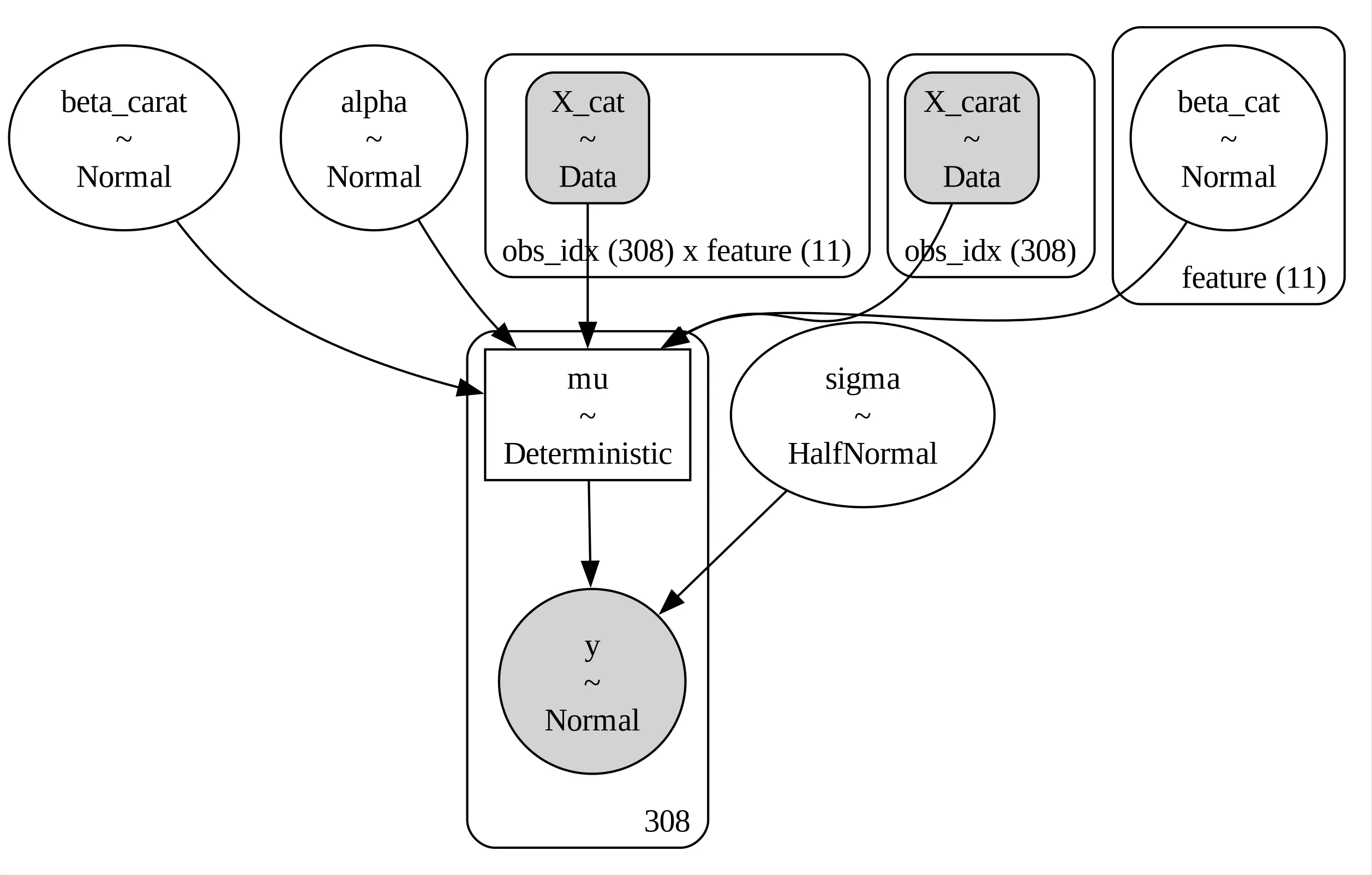
In our model $\alpha$ is the intercept for the baseline diamond, $\beta_{cat}$ the average log-price difference associated to the categorical variables and $\beta_{carat}$ the slope, while $sigma$ is the standard deviation of our model.
As explained by Gelman, it is often suitable to replace a continuous regressor $X$ with its standardized version, as we did in our model, in order to simplify the comparison between the corresponding variable and the ones associated to discrete variables. We divided by two standard deviations so that a difference between $-\sigma$ and $\sigma$ is not mapped into a $\Delta X = 1\,.$
By using the standardized regressor, we also have two more advantages. The first one is that the parameter $\alpha$ is now associated with an observable quantity, namely the value of the log price when the carat number is equal to the average carat number, and we don’t need to relate it to the extrapolated log price when the carat number is 0. The second advantage is that it is now easier to guess a prior for $\beta_{carat}\,,$ while it might not be so easy to do the same for the un-standardized regressor.
We can now fit our model
with model:
    idata = pm.sample(nuts_sampler='numpyro', random_seed=rng)

az.plot_trace(idata, var_names=['alpha', 'beta', 'sigma'], filter_vars='like')
fig = plt.gcf()
fig.tight_layout()
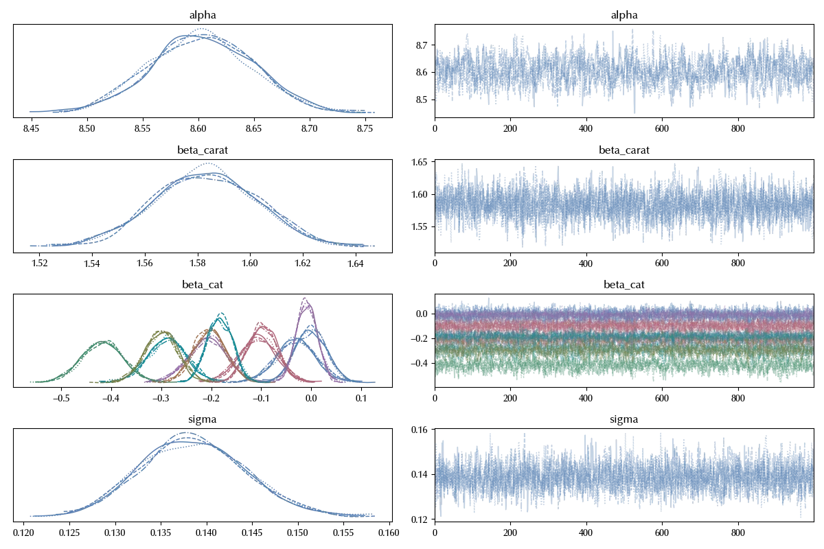
The traces look fine, let us now take a look at the posterior predictive
with model:
    idata.extend(pm.sample_posterior_predictive(idata, random_seed=rng))

az.plot_ppc(idata)
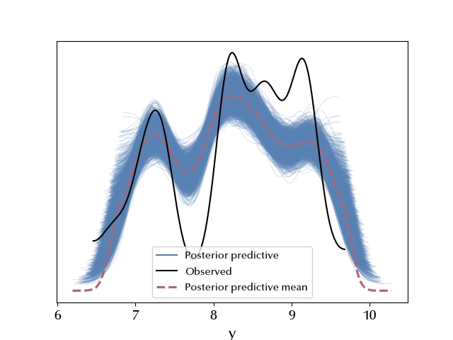
It doesn’t look like our model is appropriate to describe the data: the log-price is overestimated close to the tails, while it is underestimated close to the center of the distribution.
If we look again at the carat vs log-price scatterplot, it looks like close to 0 the behavior is not polynomial, and this suggests us that we should use, as independent variable, a function of $x$ which is not analytic in 0. The two most common choices are the logarithm and the square root. We will follow the linked article and use the square root.
with pm.Model(coords=coords) as model_s:
with pm.Model(coords=coords) as model_s:
    alpha = pm.Normal('alpha', mu=0, sigma=10)
    X_cat = pm.Data('X_cat', value=df_cat, dims=['obs_idx', 'feature'])
    X_carat = pm.Data('X_carat', value=(np.sqrt(df['carat'])-np.mean(np.sqrt(df['carat'])))/(np.mean(np.sqrt(df['carat']))), dims=['obs_idx'])
    beta_cat = pm.Normal('beta_cat', dims=['feature'], mu=0, sigma=10)
    beta_carat = pm.Normal('beta_carat', mu=0, sigma=10)
    sigma = pm.HalfNormal('sigma', sigma=20)
    mu = pm.Deterministic('mu', alpha + pm.math.dot(beta_cat, X_cat.T) + beta_carat*X_carat)
    y = pm.Normal('y', mu=mu, sigma=sigma, observed=yobs)
    idata_s = pm.sample(nuts_sampler='numpyro', random_seed=rng)

az.plot_trace(idata_s, var_names=['alpha', 'beta', 'sigma'], filter_vars='like')
fig = plt.gcf()
fig.tight_layout()
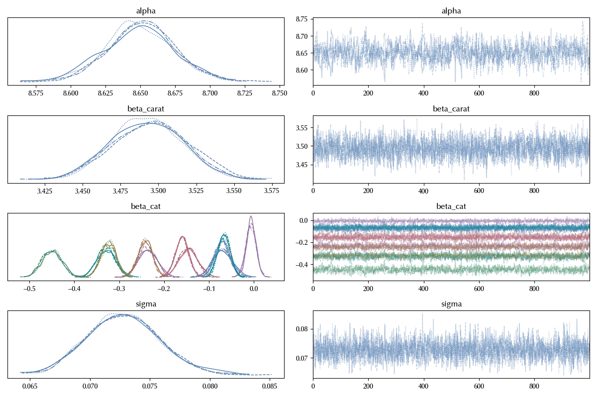
Also in this case the trace looks fine. Let us now look at the posterior predictive distribution
with model_s:
    idata_s.extend(pm.sample_posterior_predictive(idata_s, random_seed=rng))

az.plot_ppc(idata_s)
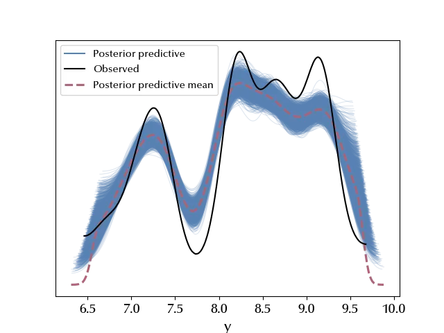
It looks like the result slightly improved. Let us try and compare the two models.
with model:
    pm.compute_log_likelihood(idata)

with model_s:
    pm.compute_log_likelihood(idata_s)

df_comp = az.compare({'linear': idata, 'square root': idata_s})

df_comp
| rank | elpd_loo | p_loo | elpd_diff | weight | se | dse | warning | scale | |
|---|---|---|---|---|---|---|---|---|---|
| square root | 0 | 363.968 | 13.2115 | 0 | 1 | 9.61651 | 0 | False | log |
| linear | 1 | 164.762 | 13.7875 | 199.206 | 6.12772e-10 | 9.96487 | 8.65212 | False | log |
az.plot_compare(df_comp)
fig = plt.gcf()
fig.tight_layout()
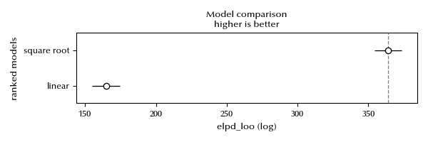
There are no warnings, we can therefore consider the estimate as reliable, and there is no doubt that the latter model greatly improved the result.
Let us also take a look at the LOO-PIT
fig, ax = plt.subplots(ncols=2, figsize=(15, 6))
az.plot_loo_pit(idata_s, y='y', ax=ax[0])
az.plot_loo_pit(idata_s, y='y', ax=ax[1], ecdf=True)
fig.tight_layout()
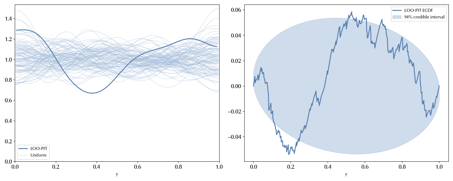
There is still margin for improvement, as it doesn’t really look like the LOO-PIT is compatible with the uniform distribution. We won’t however improve our model for now.
Let us instead inspect the impact of the categorical variables on the log price
fig = plt.figure()
ax = fig.add_subplot(111)
az.plot_forest(idata_s, var_names='beta_cat', filter_vars='like', ax=ax, combined=True)
ax.set_yticklabels(df_cat.columns)
ax.axvline(x=0, ls=':', color='grey')
fig.tight_layout()
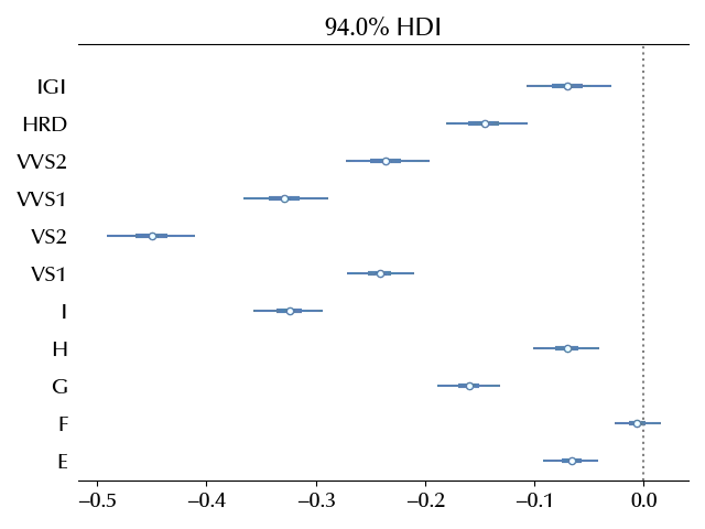
All the categorical variables has an important effect on the log price, as we expected. In this case, we already knew which variables to include in our model, in general it won’t be this case, as you might have more variables than needed.
Gelman, in the textbook “Data Analysis Using Regression and Multilevel/Hierarchical Models”. suggests the following method to decide which variables are relevant:
Keep all variables that you expect might be relevant in the outcome prediction. If you also have additional variables:
| A parameter | has the expected sign | does not have the expected sign |
|---|---|---|
| is not significant | Keep it | Don’t keep it |
| is significant | Keep it | You should ask yourself why this is happening. Are you not considering a variable? |
Finally, if an independent variable has a large effect, consider including an interaction term.
Conclusion
The regression with multiple variables is a deep topic, and we barely introduced the main concepts and gave few hints on how to work with this kind of model. We did so by using a real-World dataset, and we also showed some of the issues one might face when dealing with problematic datasets.
Suggested readings
- Gelman, A., Hill, J. (2007). Data Analysis Using Regression and Multilevel/Hierarchical Models. CUP.
%load_ext watermark
%watermark -n -u -v -iv -w -p xarray,pytensor
Python implementation: CPython
Python version : 3.12.7
IPython version : 8.24.0
xarray : 2024.9.0
pytensor: 2.25.5
matplotlib: 3.9.2
arviz : 0.20.0
seaborn : 0.13.2
pandas : 2.2.3
pymc : 5.17.0
numpy : 1.26.4
Watermark: 2.4.3
