

Application of the Lotka-Volterra model
In the last post we saw how to implement an ODE solver in PyMC, and we did so by using a dataset by Gause. In this post we will go a little bit forward, and we will see how we could use the above concepts to try and falsify the model proposed in Gause’s textbook. We will use another dataset provided in the same repo, in particular the one containing the data shown in fig. 25 of the same book. In this example Gause considers two paramecium species, one named Paramecium Caudatum and the other named Paramecium Aurelia. Gause first measured how the volume occupied by each specie varied with time by keeping them separate but with the same environment, then he put them together without varying the environment. In the first case (labelled as “Monoculture”), the volume occupied should follow the logistic model for each specie.
\[\frac{dy_i(t)}{dt} = \lambda_i y_i(t) \left(1-\frac{y_i(t)}{K_i}\right)\]while in the latter (labelled as “Mixed”) we should observe a competition between the two species
\[\frac{dy_i(t)}{dt} = \lambda_i y_i(t) \left(1-\frac{y_i(t)-\gamma y_{-i}(t)}{K_i}\right)\,.\]First of all, we notice that the parameters $\lambda_i$ and $K_i$ should not vary in the two cases, since they only depend on the specie and on the environment. This implies that if we only fit the monoculture dataset, we should obtain an estimate for the above parameters which is compatible with the combined fit of the two cases.
We will also test the predictive power of the model, by only using the initial data for the mixed case, and we will then verify if our prediction is compatible with the observed data.
Data import and preprocessing
import pyreadr
import pandas as pd
import seaborn as sns
import pymc as pm
import arviz as az
import numpy as np
from matplotlib import pyplot as plt
import pytensor as pt

rng = np.random.default_rng(421124)

df_0 = pyreadr.read_r('data/gause_1934_book_f25.rda')

df = df_0['gause_1934_book_f25']

df.head()
| Paper | Figure | Species | Time | Volume | Treatment | |
|---|---|---|---|---|---|---|
| 0 | Gause_book_1934 | 25 | Paramecium caudatum | 0.988805 | 7.581 | Monoculture |
| 1 | Gause_book_1934 | 25 | Paramecium caudatum | 1.96537 | 31.4395 | Monoculture |
| 2 | Gause_book_1934 | 25 | Paramecium caudatum | 2.9918 | 46.2918 | Monoculture |
| 3 | Gause_book_1934 | 25 | Paramecium caudatum | 4.02315 | 76.0357 | Monoculture |
| 4 | Gause_book_1934 | 25 | Paramecium caudatum | 5.00452 | 114.439 | Monoculture |
target = 'Volume'

fig, ax = plt.subplots(nrows=2)
sns.scatterplot(df[df['Species']=='Paramecium caudatum'], x='Time', y=target, hue='Treatment', ax=ax[0])
sns.scatterplot(df[df['Species']=='Paramecium aurelia'], x='Time', y=target, hue='Treatment', ax=ax[1])
ax[0].set_title('Paramecium caudatum')
ax[1].set_title('Paramecium aurelia')
fig.tight_layout()
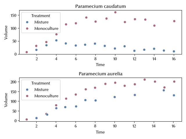
You should notice that the measurements start at different time and are not equally spaced. This will require a little bit of work in order to set a proper integration step and in order to ensure consistent boundary conditions.
n_steps = 5

dfb1_all = df[((df['Species']=='Paramecium caudatum') & (df['Treatment']=='Mixture'))].iloc[1:]

dfb2_extra = df[((df['Species']=='Paramecium aurelia') & (df['Treatment']=='Mixture'))].sort_values('Time').iloc[7:]

dfb2_all = df[((df['Species']=='Paramecium aurelia') & (df['Treatment']=='Mixture'))].sort_values('Time').iloc[1:]

dfa1 = df[((df['Species']=='Paramecium caudatum') & (df['Treatment']=='Monoculture'))].sort_values('Time').iloc[1:]
dfa2 = df[((df['Species']=='Paramecium aurelia') & (df['Treatment']=='Monoculture'))].sort_values('Time').iloc[2:]

dfb2 = df[((df['Species']=='Paramecium aurelia') & (df['Treatment']=='Mixture'))].sort_values('Time').iloc[1:-4]
dfb1 = df[((df['Species']=='Paramecium caudatum') & (df['Treatment']=='Mixture'))].sort_values('Time').iloc[1:1+len(dfb2)]
The last four datasets will be the fitted ones, while the other ones are build in order to have an easy comparison. We skipped some initial point because we want a similar initial condition in the monoculture treatment and in the mixed one for each of the two species. For the sake of convenience, we will assume a step equal to 1 for all the observations, except for the mixed aurelia above Time equal to 8, where we assume a step equal to 2. Finally, we will use an integration step of 1/5 in order to ensure the convergence of the discretized integration.
Fitting the data
As we anticipated, we will initially only consider the monoculture case, and we will use the same model of the last post.
with pm.Model(coords={'specie': df['Species'].drop_duplicates()}) as model_mono:
    lam = pm.HalfNormal('lam', 2, shape=(2), dims=('specie'))
    kappa = pm.HalfNormal('kappa', 2, shape=(2), dims=('specie'))
    nu = pm.HalfNormal('nu', 0.5, shape=(2), dims=('specie'))
    sigma = pm.HalfNormal('sigma', 0.5)
    def dn(n, lam, kappa):
        return n*lam*(kappa-n)/kappa
    def f_update(n, lam, kappa, h):
        return n+h*dn(n, lam, kappa)
    mu1, update1 = pt.scan(fn=f_update,
                     outputs_info=[nu[0]],
                    non_sequences=[lam[0], kappa[0], 1/n_steps],
                    n_steps=n_steps*len(dfa1))
    mu2, update2 = pt.scan(fn=f_update,
                     outputs_info=[nu[1]],
                    non_sequences=[lam[1], kappa[1], 1/n_steps],
                    n_steps=n_steps*len(dfa2))
    y1 = pm.Normal('y1', mu=pm.math.log(mu1[::n_steps]), sigma=sigma, observed=np.log(dfa1[target]/100))
    y2 = pm.Normal('y2', mu=pm.math.log(mu2[::n_steps]), sigma=sigma, observed=np.log(dfa2[target]/100))

with model_mono:
    idata_mono = pm.sample(nuts_sampler='numpyro', target_accept=0.9, draws=5000, tune=5000)

az.plot_trace(idata_mono)
fig = plt.gcf()
fig.tight_layout()
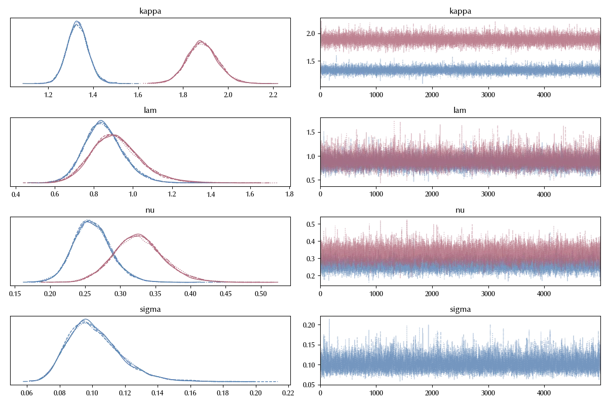
The trace looks fine, let us inspect the posterior predictive distribution
with model_mono:
    idata_mono.extend(pm.sample_posterior_predictive(idata_mono))

fig, ax = plt.subplots(nrows=2)
ax[0].fill_between(dfa1['Time'], 100*np.exp(idata_mono.posterior_predictive['y1']).quantile(q=0.03, dim=('draw', 'chain')),
                100*np.exp(idata_mono.posterior_predictive['y1']).quantile(q=0.97, dim=('draw', 'chain')),
                alpha=0.8, color='lightgray'
               )
ax[0].plot(dfa1['Time'], 100*np.exp(idata_mono.posterior_predictive['y1']).mean(dim=('draw', 'chain')),
       color='k', ls=':')
# ax.plot(df_data['Time'], yobs)
sns.scatterplot(dfa1, x='Time', y=target,
               ax=ax[0])

ax[1].fill_between(dfa2['Time'], 100*np.exp(idata_mono.posterior_predictive['y2']).quantile(q=0.03, dim=('draw', 'chain')),
                100*np.exp(idata_mono.posterior_predictive['y2']).quantile(q=0.97, dim=('draw', 'chain')),
                alpha=0.8, color='lightgray'
               )
ax[1].plot(dfa2['Time'], 100*np.exp(idata_mono.posterior_predictive['y2']).mean(dim=('draw', 'chain')),
       color='k', ls=':')
# ax.plot(df_data['Time'], yobs)
sns.scatterplot(dfa2, x='Time', y=target,
               ax=ax[1])
fig.tight_layout()
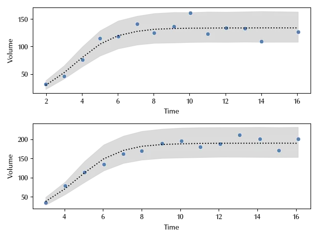
The data seems compatible with the model fit. Let us now switch to the combined model.
with pm.Model(coords={'specie': df['Species'].drop_duplicates()}) as model:
    lam = pm.HalfNormal('lam', 2, shape=(2), dims=('specie'))
    kappa = pm.HalfNormal('kappa', 2, shape=(2), dims=('specie'))
    gamma = pm.HalfNormal('gamma', 2, shape=(2), dims=('specie'))
    nu = pm.HalfNormal('nu', 0.5, shape=(2), dims=('specie'))
    sigma = pm.HalfNormal('sigma', 0.5, shape=(2))
    def dn(n, lam, kappa):
        return n*lam*(kappa-n)/kappa
    def f_update(n, lam, kappa, h):
        return n+h*dn(n, lam, kappa)
    mu1, update1 = pt.scan(fn=f_update,
                     outputs_info=[nu[0]],
                    non_sequences=[lam[0], kappa[0], 1/n_steps],
                    n_steps=n_steps*len(dfa1))
    mu2, update2 = pt.scan(fn=f_update,
                     outputs_info=[nu[1]],
                    non_sequences=[lam[1], kappa[1], 1/n_steps],
                    n_steps=n_steps*len(dfa2))
    def f_update_inter(n1, n2, lam1, lam2, kappa1, kappa2, gamma1, gamma2, h):
        return (n1+h*n1*lam1*(kappa1-n1-gamma1*n2)/kappa1, n2+h*n2*lam2*(kappa2-n2-gamma2*n1)/kappa2)

    mu_inter, update_inter = pt.scan(fn=f_update_inter,
                     outputs_info=[nu[0], nu[1]],
                    non_sequences=[lam[0], lam[1], kappa[0], kappa[1], gamma[0], gamma[1], 1/n_steps],
                    n_steps=n_steps*len(dfb1_all))

    y1 = pm.Normal('y1', mu=pm.math.log(mu1[::n_steps]), sigma=sigma[0], observed=np.log(dfa1[target]/100))
    y2 = pm.Normal('y2', mu=pm.math.log(mu2[::n_steps]), sigma=sigma[0], observed=np.log(dfa2[target]/100))
    y1n = pm.Normal('y1n', mu=pm.math.log(mu_inter[0][:n_steps*len(dfb1):n_steps]), sigma=sigma[1], observed=np.log(dfb1[target]/100))
    y1nall = pm.Normal('y1nall', mu=pm.math.log(mu_inter[0][::n_steps]), sigma=sigma[1])
    y2e = pm.Normal('y2e', mu=pm.math.log(mu_inter[1][n_steps*len(dfb2[target])::2*n_steps]), sigma=sigma[1])
    y2n = pm.Normal('y2n', mu=pm.math.log(mu_inter[1][:n_steps*len(dfb2[target]):n_steps]), sigma=sigma[1], observed=np.log(dfb2[target]/100))

with model:
    idata = pm.sample(nuts_sampler='numpyro', target_accept=0.98, draws=5000, tune=5000, random_seed=rng)

az.plot_trace(idata, var_names=['kappa', 'lam', 'nu', 'gamma', 'sigma')
fig = plt.gcf()
fig.tight_layout()
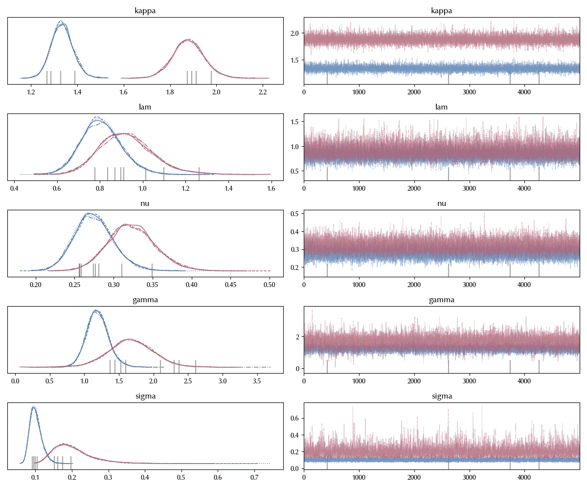
Also in this case the traces are fine. Before moving to the posterior predictive check, we can verify if the relevant common parameters between the two models are compatible.
az.plot_forest([idata_mono, idata], var_names=['lam', 'kappa'])
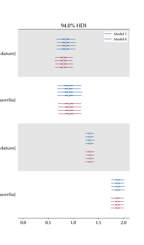
The parameters are almost identical. On the one hand, this is a good indication that the parameters are proper of the specie and of the environment and do not depend on the other species. On the other, we should keep in mind that in the case of mixed species, the observations looks much more noisy than in the monoculture case, and this might hide the presence of a change in the values of the parameters, so we don’t consider the conclusion as too robust.
Let us now inspect the posterior predictive distribution.
with model:
    idata.extend(pm.sample_posterior_predictive(idata))

y2mean = 100*np.concatenate([np.exp(idata.posterior_predictive['y2n']).mean(dim=('draw', 'chain')), np.exp(idata.posterior['y2e']).mean(dim=('draw', 'chain'))])
y2l = 100*np.concatenate([np.exp(idata.posterior_predictive['y2n']).quantile(q=0.03, dim=('draw', 'chain')), np.exp(idata.posterior['y2e']).quantile(q=0.03, dim=('draw', 'chain'))])
y2h = 100*np.concatenate([np.exp(idata.posterior_predictive['y2n']).quantile(q=0.97, dim=('draw', 'chain')), np.exp(idata.posterior['y2e']).quantile(q=0.97, dim=('draw', 'chain'))])

fig, ax = plt.subplots(nrows=2, ncols=2, figsize=(12, 6))
ax[0][0].fill_between(dfa1['Time'], 100*np.exp(idata.posterior_predictive['y1']).quantile(q=0.03, dim=('draw', 'chain')),
                100*np.exp(idata.posterior_predictive['y1']).quantile(q=0.97, dim=('draw', 'chain')),
                alpha=0.8, color='lightgray'
               )
ax[0][0].plot(dfa1['Time'], 100*np.exp(idata.posterior_predictive['y1']).mean(dim=('draw', 'chain')),
       color='k', ls=':')
# ax.plot(df_data['Time'], yobs)
sns.scatterplot(dfa1, x='Time', y=target,
               ax=ax[0][0])

ax[0][1].fill_between(dfa2['Time'], 100*np.exp(idata.posterior_predictive['y2']).quantile(q=0.03, dim=('draw', 'chain')),
                100*np.exp(idata.posterior_predictive['y2']).quantile(q=0.97, dim=('draw', 'chain')),
                alpha=0.8, color='lightgray'
               )
ax[0][1].plot(dfa2['Time'], 100*np.exp(idata.posterior_predictive['y2']).mean(dim=('draw', 'chain')),
       color='k', ls=':')
# ax.plot(df_data['Time'], yobs)
sns.scatterplot(dfa2, x='Time', y=target,
               ax=ax[0][1])


ax[1][0].fill_between(dfb1_all['Time'], 100*np.exp(idata.posterior['y1nall']).quantile(q=0.03, dim=('draw', 'chain')),
                100*np.exp(idata.posterior['y1nall']).quantile(q=0.97, dim=('draw', 'chain')),
                alpha=0.8, color='lightgray'
               )
ax[1][0].plot(dfb1_all['Time'], 100*np.exp(idata.posterior['y1nall']).mean(dim=('draw', 'chain')),
       color='k', ls=':')
# ax.plot(df_data['Time'], yobs)
sns.scatterplot(dfb1_all, x='Time', y=target,
               ax=ax[1][0])
ax[1][0].axvline(x=dfb1['Time'].iloc[-1], ls='--', color='grey')

ax[1][1].fill_between(t2all, y2l, y2h,
                alpha=0.8, color='lightgray'
               )
ax[1][1].plot(dfb2_all['Time'], y2mean,
       color='k', ls=':')
ax[1][1].axvline(x=dfb2['Time'].iloc[-1], ls='--', color='grey')
# ax.plot(df_data['Time'], yobs)
sns.scatterplot(dfb2_all , x='Time', y=target,
               ax=ax[1][1])
fig.tight_layout()
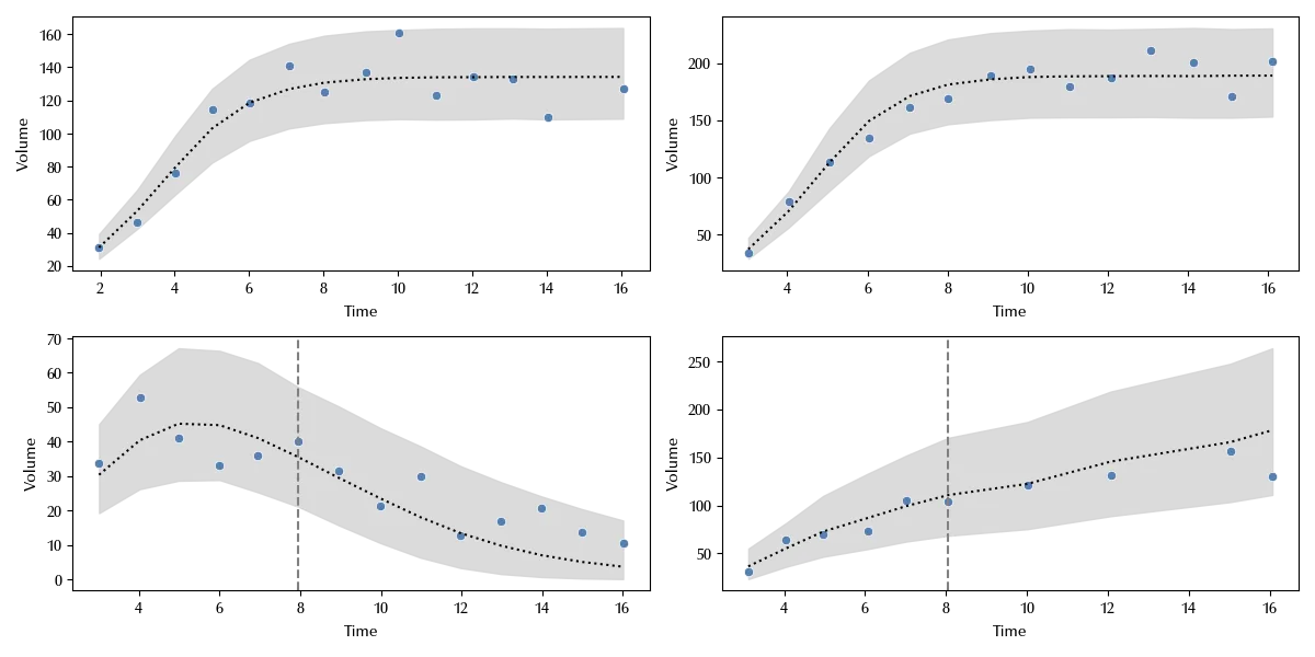
The grey dashed line represents the last fitted point, and we see that we have a very nice agreement both in the fitted region, both in the predicted region.
Conclusions
In this example, we tried and use PyMC to show how we could test Gause’s hypothesis, and we used a numerical algorithm to solve the Lotka-Volterra model to do so. The Lotka-Volterra model seems to be appropriate in describing the observed data, but of course this is just one experiment, and many more would be needed (and have already been done) do draw some sensible conclusion.
Suggested readings
- Gause, G. F. (2019). The Struggle for Existence: A Classic of Mathematical Biology and Ecology. Dover Publications.
- Press, W. H. (2007). Numerical Recipes 3rd Edition: The Art of Scientific Computing. Cambridge University Press.
%load_ext watermark
%watermark -n -u -v -iv -w -p xarray,numpyro,jax,jaxlib
Python implementation: CPython
Python version : 3.12.5
IPython version : 8.24.0
xarray : 2024.5.0
numpyro: 0.15.0
jax : 0.4.28
jaxlib : 0.4.28
pytensor : 2.25.3
pyreadr : 0.5.2
pymc : 5.16.2
matplotlib: 3.9.0
seaborn : 0.13.2
arviz : 0.18.0
pandas : 2.2.2
numpy : 1.26.4
Watermark: 2.4.3