

MRP
MRP stands for Multilevel Regression and Post-stratification, and is a very popular way to make inference based on surveys, especially with the ones with selected samples.
The main issue with sampling is how to deal with non-responders, and MrP allows you to correct for this issue if it is properly done. You can consider MrP as a two-stage procedure:
- Perform a multilevel regression on your sample
- re-weight the probabilities of each of your subpopulations with weights extracted from a census to obtain the population probability.
Using multilevel regression allows you to share information across subpopulations, so the variance distribution will have a smoother behavior across them with respect to a single-level model. Post-stratification is instead needed because, even if your sample is a random sample of your population, non-respondence might be no random at all, and this could introduce a sampling bias into the respondent sample. You should however always be very careful with surveys. In fact, as J. Ornstein reminds us in Causality in Policy Studies:
MRP is not a panacea, and one should be skeptical of estimates produced from small-sample surveys, regardless of how they are operationalized.
Joseph T. Ornstein
In the following we will use MRP to analyze the data collected in this study on conspiracy believes of the Italian population, and the dataset can be downloaded from this link. We will adapt the MRP model as shown in “MRP case studies” by Juan Lopez-Martin, Justin H. Phillips, and Andrew Gelman.
Data import and initial transformations
In this first part we will re-organize the data prepare the datasets for the fit. This part is quite technical, and I decided to keep it because it might be useful to see that the data preparation can be a rather cumbersome procedure, but the uninterested reader can safely skip it. The population dataset has been obtained from the ISTAT -the official italian statistics institute- webpage.
We used this dataset because, as it is well known, education is a very relevant factor in conspiracy beliefs, so we used the dataset where the italian population is given by age, sex, geographic area and education level.
import pandas as pd
import seaborn as sns
import pymc as pm
import arviz as az
import numpy as np
from matplotlib import pyplot as plt
from scipy.stats import norm

rng = np.random.default_rng(42)

df_anag = pd.read_csv('data/istruzione.csv')

df_anag.head()
| Anno | Regione | Sesso | Fascia | Elementare | Media | Professionale | Maturita | Laurea | Totale | |
|---|---|---|---|---|---|---|---|---|---|---|
| 0 | 2020 | N | M | 15-24 anni | 12 | 667 | 90 | 518 | 63 | 1350 |
| 1 | 2020 | N | M | 25-29 anni | 6 | 121 | 80 | 300 | 190 | 698 |
| 2 | 2020 | N | M | 30-34 anni | 8 | 184 | 84 | 271 | 189 | 737 |
| 3 | 2020 | N | M | 35-39 anni | 9 | 227 | 92 | 282 | 201 | 811 |
| 4 | 2020 | N | M | 40-44 anni | 20 | 298 | 108 | 356 | 184 | 965 |
df_data = pd.read_spss('./data/dib_104144_dataset.sav')

df_data = df_data[['region', 'sex', 'age', 'edu', 'cb11']]

df_data['y0'] = df_data['cb11'].replace({'Completely disagree': 1, 'Completely agree': 5})

df_data.to_markdown()
| region | sex | age | edu | cb11 | y0 | |
|---|---|---|---|---|---|---|
| 0 | Center | Female | 37 | degree | Completely disagree | 1 |
| 1 | Center | Female | 20 | high school | Completely disagree | 1 |
| 2 | Center | Female | 19 | high school | Completely disagree | 1 |
| 3 | Center | Female | 19 | high school | Completely disagree | 1 |
| 4 | North | Female | 31 | high school | Completely disagree | 1 |
The target variable is the answer to the question “Vaccines are useless and dangerous, they are only instrumental to the financial interests of pharmaceutical companies” from Avoidant attachment style and conspiracy ideation and the answer goes from 1 (completely disagree) to 5 (completely agree). We will transform it and make it binary, and the transformed variable will be 1 if the respondent answered 4 or 5 to the above question. As regressors, we will use as starting point:
- the region, marked N for North, C for center and M for south or islands.
- the sex (M/F)
- the age (integer)
- the education level
Let us look to the education
df_data.groupby('edu').count()['region']
0.0 6
degree 306
high school 350
no qualifications 2
post graduate 73
primary school 3
secondary school 34
Name: region, dtype: int64
Since in Italy the vast majority of the adult population has at least a high school degree, we will only use the university degree as regressor, otherwise we wouldn’t have a sufficient number of subject in order to get a reliable estimate of the regression coefficients.
Let us now stratify the age, since it doesn’t make much sense to the bare age as regressor.
df_a0 = df_anag[df_anag['Fascia'].isin(['15-24 anni', '25-29 anni'])].groupby(
    ['Regione', 'Sesso']).sum()[['Maturita', 'Laurea', 'Totale']].reset_index()
df_a1 = df_anag[df_anag['Fascia'].isin(['30-34 anni', '35-39 anni'])].groupby(
    ['Regione', 'Sesso']).sum()[['Maturita', 'Laurea', 'Totale']].reset_index()
df_a2 = df_anag[df_anag['Fascia'].isin(['40-44 anni', '45-49 anni'])].groupby(
    ['Regione', 'Sesso']).sum()[['Maturita', 'Laurea', 'Totale']].reset_index()
df_a3 = df_anag[df_anag['Fascia'].isin(['50-54 anni', '55-59 anni'])].groupby(
    ['Regione', 'Sesso']).sum()[['Maturita', 'Laurea', 'Totale']].reset_index()
df_a4 = df_anag[df_anag['Fascia'].isin(['60-64 anni', '65 anni e più'])].groupby(
    ['Regione', 'Sesso']).sum()[['Maturita', 'Laurea', 'Totale']].reset_index()

df_a0['Gruppo'] = 0
df_a1['Gruppo'] = 1
df_a2['Gruppo'] = 2
df_a3['Gruppo'] = 3
df_a4['Gruppo'] = 4

df_anag_new = pd.concat([df_a0, df_a1, df_a2, df_a3, df_a4])
We can now transform the sample dataframe
df_fit = df_data[['region', 'sex', 'age', 'edu', 'y0']]
df_fit['Centro'] = (df_fit['region']=='Center').astype(int)
df_fit['Mezzogiorno'] = (df_fit['region'].isin(['South', 'Islands'])).astype(int)
df_fit['is_male'] = (df_fit['sex']=='Male').astype(int)
df_fit['has_degree'] = df_fit['edu'].isin(['degree', 'post graduate']).astype(int)
df_fit = df_fit[df_fit['age']>0]  # if the age is not reported "age" has value -99

def map_age(x):
    if x < 30 and x>0:
        return 0
    elif x >= 30 and x < 40:
        return 1
    elif x >= 40 and x < 50:
        return 2
    elif x >= 50 and x < 60:
        return 3
    elif x >= 60:
        return 4

df_fit['Gruppo'] = df_fit['age'].map(map_age).astype(int)

df_fit['y'] = (df_fit['y0'].astype(int)>3).astype(int)
Explorative analysis
We can now look for differences between the survey sample and the italian population.
df_anag_new['NoLaurea'] = df_anag_new['Totale']-df_anag_new['Laurea']
df_anag_deg = df_anag_new.melt(value_vars=['Laurea', 'NoLaurea'],
                               id_vars=['Regione', 'Sesso', 'Gruppo', 'Totale'],
                               value_name='number', var_name='has_degree')
df_anag_deg['has_degree'] = (df_anag_deg['has_degree']=='Laurea').astype(int)

df_anag_deg['frac'] = df_anag_deg['number']/df_anag_deg['number'].sum()

df_anag_deg['Centro'] = (df_anag_deg['Regione']=='C').astype(int)
df_anag_deg['Mezzogiorno'] = (df_anag_deg['Regione']=='M').astype(int)
df_anag_deg['is_male'] = (df_anag_deg['Sesso']=='M').astype(int)

df_means_by_group = df_fit[['Centro', 'Mezzogiorno', 'is_male', 'Gruppo', 'has_degree', 'y']].groupby(
    ['Centro', 'Mezzogiorno', 'is_male', 'Gruppo', 'has_degree']).mean().reset_index()
df_n_by_group = df_fit[['Centro', 'Mezzogiorno', 'is_male', 'Gruppo', 'has_degree', 'y']].groupby(
    ['Centro', 'Mezzogiorno', 'is_male', 'Gruppo', 'has_degree']).count().reset_index()
We prepared two auxiliary datasets, and the last one counts how many units for each stratum are present in the dataset.
(df_n_by_group['y']==0).astype(int).sum()
There is at least one unit for each stratum, and this is a first indicator that our age groups are large enough. Let us compare the population percentages for each regression variable with the corresponding sample percentage.
df_n_by_group['Regione'] = np.where(df_n_by_group['Centro']==1,
                                    'C', np.where(df_n_by_group['Mezzogiorno']==1, 'M', 'N'))

fig, ax = plt.subplots(nrows=2, ncols=2, figsize=(9, 5))
sns.barplot(df_anag_deg.groupby('Gruppo').sum()['frac'].reset_index().rename(columns={'frac': 'y'}),
             x='Gruppo', y='y', fill=False, ax=ax[0][0])
sns.barplot((df_n_by_group.groupby('Gruppo').sum()['y']/df_n_by_group.groupby('Gruppo').sum()['y'].sum()).reset_index(),
             x='Gruppo', y='y', fill=False, ax=ax[0][0], ls=':')

sns.barplot(df_anag_deg.groupby('has_degree').sum()['frac'].reset_index().rename(columns={'frac': 'y'}),
             x='has_degree', y='y', fill=False, ax=ax[0][1], label='Population')
sns.barplot((df_n_by_group.groupby('has_degree').sum()['y']/df_n_by_group.groupby('has_degree').sum()['y'].sum()).reset_index(),
             x='has_degree', y='y', fill=False, ax=ax[0][1], ls=':', label='Sample')

legend = ax[0][1].legend(loc='upper right', bbox_to_anchor=(1.5, 0.9))
legend.get_frame().set_alpha(0)
sns.barplot(df_anag_deg.groupby('Regione').sum()['frac'].reset_index().rename(columns={'frac': 'y'}),
             x='Regione', y='y', fill=False, ax=ax[1][0])
sns.barplot((df_n_by_group.groupby(['Regione']).sum()['y']/df_n_by_group['y'].sum()).reset_index(),
             x='Regione', y='y', fill=False, ax=ax[1][0], ls=':')

sns.barplot(df_anag_deg.groupby('is_male').sum()['frac'].reset_index().rename(columns={'frac': 'y'}),
             x='is_male', y='y', fill=False, ax=ax[1][1])
sns.barplot((df_n_by_group.groupby('is_male').sum()['y']/df_n_by_group.groupby('is_male').sum()['y'].sum()).reset_index(),
             x='is_male', y='y', fill=False, ax=ax[1][1], ls=':')


fig.tight_layout()

There are very large differences between the sample and the population, and this might lead to an unreliable estimate for our target variable.
Fitting the model
We will use a hierarchical model with the previously mentioned regressors, and the implemented model is the following one:
\[\begin{align*} logit P(y^i=1) = & \theta^i \\ \\ \theta^i = & \alpha + \gamma_{C} X^i_{Centro}+ \gamma_{M} X^i_{Mezzogiorno} \\ & + \beta_{Male} X^i_{Male} + \beta_{Group}^{g[i]}+ \beta_{Degree}^{g[i]} X^{i}_{Degree} \\ & + \beta_{Male, Edu}^{g[i]}X^i_{Male} X^{i}_{Degree} \end{align*}\]
with pm.Model() as model:
    alpha = pm.Normal('alpha', mu=0, sigma=5)
    sigma_group = pm.Exponential('sigma_group', 1)
    sigma_degree = pm.Exponential('sigma_degree', 0.5)
    sigma_male_edu = pm.Exponential('sigma_male_edu', 0.5)
    alpha_degree = pm.Normal('alpha_degree', mu=0, sigma=3)
    alpha_male_edu = pm.Normal('alpha_male_edu', mu=0, sigma=3)
    beta_group_std = pm.Normal('beta_group_std', mu=0, sigma=1, shape=len(df_fit['Gruppo'].drop_duplicates()))
    beta_group = pm.Deterministic('beta_group', sigma_group*beta_group_std)
    beta_male = pm.Normal('beta_male', sigma=3)
    beta_male_edu_std = pm.Normal('beta_male_edu_std', sigma=1, shape=len(df_fit['Gruppo'].drop_duplicates()))
    beta_degree_std = pm.Normal('beta_degree_std', sigma=1, shape=len(df_fit['Gruppo'].drop_duplicates()))
    beta_degree = pm.Deterministic('beta_degree', alpha_degree+beta_degree_std*sigma_degree)
    beta_male_edu = pm.Deterministic('beta_male_edu', alpha_male_edu+beta_male_edu_std*sigma_male_edu)
    gamma_centro = pm.Normal('gamma_centro', sigma=3)
    gamma_mezzogiorno = pm.Normal('gamma_mezzogiorno', sigma=3)
    mu = (alpha + beta_group[df_fit['Gruppo']] + beta_male*df_fit['is_male'] + beta_degree[df_fit['Gruppo']]*df_fit['has_degree'] + gamma_centro*df_fit['Centro']+ gamma_mezzogiorno*df_fit['Mezzogiorno']
         + beta_male_edu[df_fit['Gruppo']]*df_fit['is_male']*df_fit['has_degree'])
    y = pm.Bernoulli('y', logit_p=mu, observed=df_fit['y'])

pm.model_to_graphviz(model)
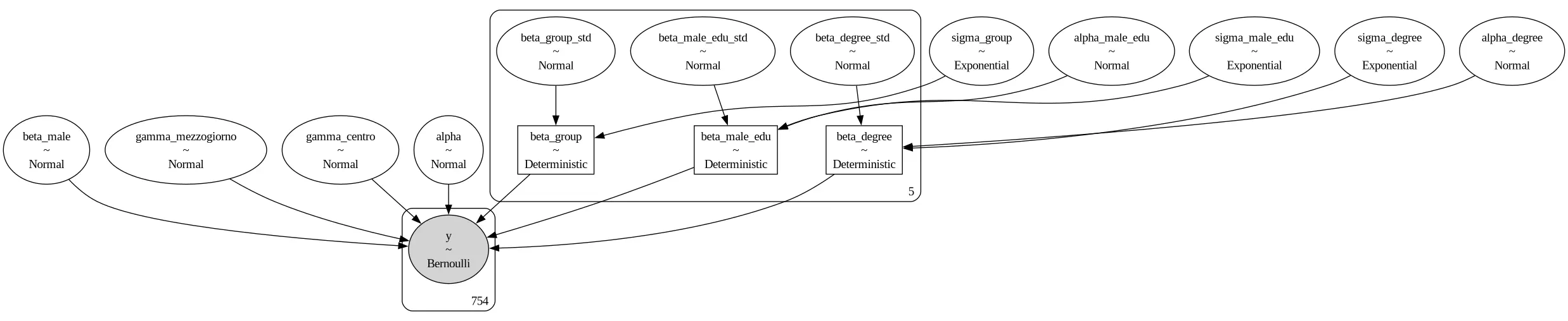
As you can see, we slightly modified our parametrization to improve the convergence. We are now ready to sample the posterior.
with model:
    idata = pm.sample(nuts_sampler='numpyro', tune=5000, draws=5000,
                      random_seed=rng, target_accept=0.85)

az.plot_trace(idata)
fig = plt.gcf()
fig.tight_layout()
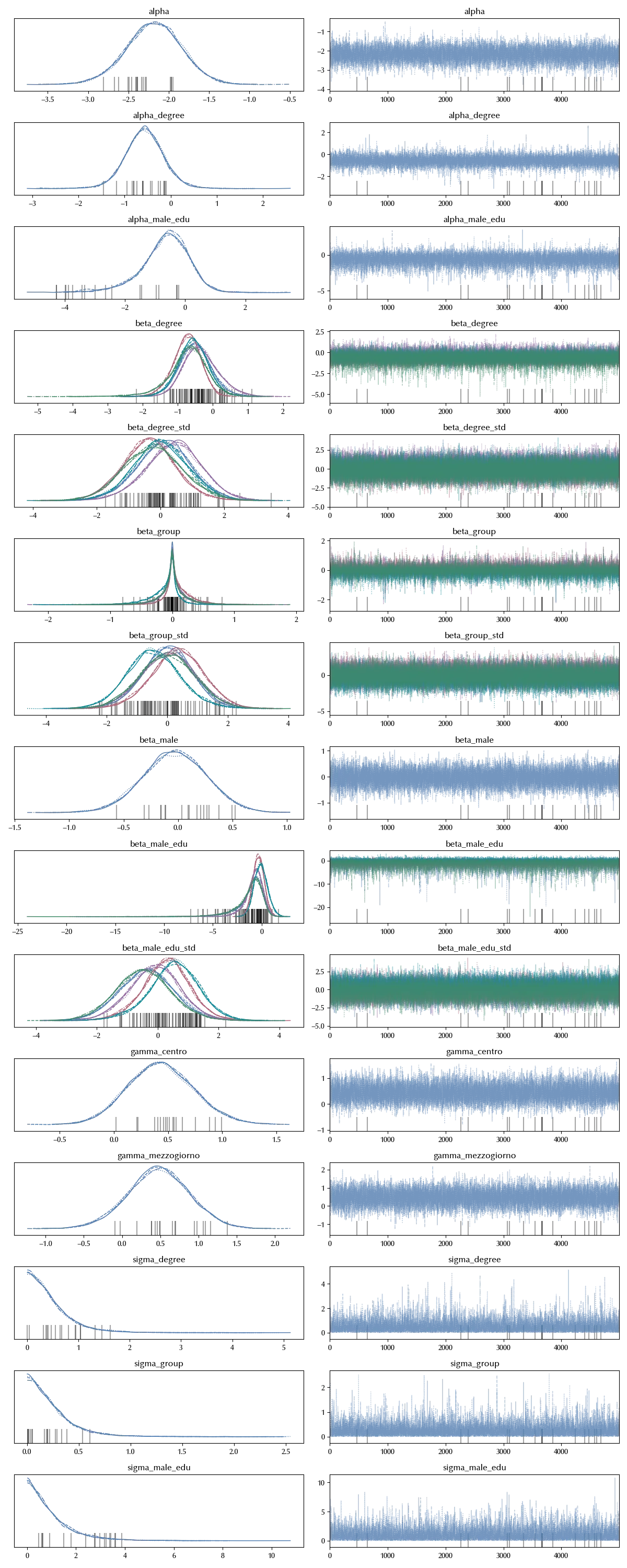
The traces look fine, but since this is quite a messy model, it is better to also inspect the $\hat{R}$ statistics
az.summary(idata)['r_hat'].max()
$\hat{R}$ is fine too, so we can assume that there are no issues with our model. Let us take a look at the separation plot
with model:
    idata.extend(pm.sample_posterior_predictive(idata, random_seed=rng))

az.plot_separation(idata, y='y')
fig = plt.gcf()
fig.tight_layout()

The result is far from being perfect, but the darker blue lines are mostly on the right hand side, so the model is doing quite a decent job. We can now verify the results of our model. Let us implement two routines to perform the model predictions, with and without post-stratification:
\[\begin{align*} \theta_{PS} = & \frac{\sum_i N_i \theta_i}{\sum_i N_i} \\ \theta_{Raw} = & \frac{\sum_i N_i^{sample} \theta_i}{\sum_i N_i^{sample}} \end{align*}\]where $N_i$ is the number of individuals in the group i (or equivalently the percentage), and $\theta_i$ the corresponding estimate.
def fcalc(df):
    dt = idata.posterior
    logit_p = (dt['alpha'].values.reshape(-1) + dt['beta_group'].sel(beta_group_dim_0=df['Gruppo']).values.reshape(-1)
               + dt['beta_male'].values.reshape(-1)*df['is_male']
               + dt['beta_degree'].sel(beta_degree_dim_0=df['Gruppo']).values.reshape(-1)*df['has_degree']
               + dt['beta_male_edu'].sel(beta_male_edu_dim_0=df['Gruppo']).values.reshape(-1)*df['has_degree']*df['is_male']
               + dt['gamma_mezzogiorno'].values.reshape(-1)*df['Mezzogiorno']
               + dt['gamma_centro'].values.reshape(-1)*df['Centro']
              )
    p = np.exp(logit_p)/(1+np.exp(logit_p))
    return p

def get_proba(df_filt, col='frac'):
    out_mean = []
    out_ql = []
    out_qh = []
    dt = 0.
    norm = df_filt[col].sum()
    for index, row in df_filt.iterrows():
        dt += fcalc(row)*row[col]/norm
    out_mean  = np.mean(dt)
    out_ql  = np.quantile(dt, q=0.05)
    out_qh = np.quantile(dt, q=0.95)
    return [out_mean, out_ql, out_qh]
We can now compare the results of the post-stratification with the corresponding raw estimate
nat_proba = get_proba(df_anag_deg)

grp_list = list(range(5))
fig, ax = plt.subplots(nrows=3, figsize=(9, 7))
for i, region in enumerate(['N', 'C', 'M']):
    ax[i].axhline(y=nat_proba[0], color='grey', ls='--')
    ax[i].axhline(y=nat_proba[1], color='grey', ls=':')
    ax[i].axhline(y=nat_proba[2], color='grey', ls=':')

    prob = np.array([get_proba(df_anag_deg[((df_anag_deg['Regione']==region) )])
           for grp in grp_list]).T
    asymmetric_error = np.array(list(zip(np.array(prob[0])-np.array(prob[1]), np.array(prob[2])-np.array(prob[0])))).T
    ax[i].errorbar(np.array(grp_list)-0.05, prob[0], yerr=asymmetric_error, ls='None')
    ax[i].scatter(np.array(grp_list)-0.05, prob[0], label=f'PS', ls='None', marker='x')

    prob1 = np.array([get_proba(df_n_by_group[((df_n_by_group['Regione']==region))], col='y')
           for grp in grp_list]).T
    asymmetric_error1 = np.array(list(zip(np.array(prob1[0])-np.array(prob1[1]), np.array(prob1[2])-np.array(prob1[0])))).T
    ax[i].errorbar(np.array(grp_list)+0.05, prob1[0], yerr=asymmetric_error1, ls='None')
    ax[i].scatter(np.array(grp_list)+0.05, prob1[0], label=f'Raw', ls='None', marker='x')

    ax[i].set_ylim([0, 0.3])
    ax[i].set_title(f"Region={region}")

    legend = ax[0].legend(loc='upper right', bbox_to_anchor=(0.94, 1.05))
    legend.get_frame().set_alpha(0)
    ax[i].set_xticks([0, 1, 2, 3, 4])
    ax[i].set_xticklabels(['<30', '30-39', '40-49', '50-59', '60+'])
fig.tight_layout()
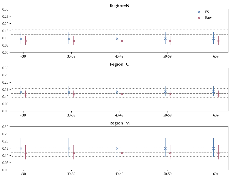
We recall that the percentages of people with a degree in our sample is very different from the one in the Italian population, and this implies that there are large differences between the post-stratified estimates and the raw estimates.
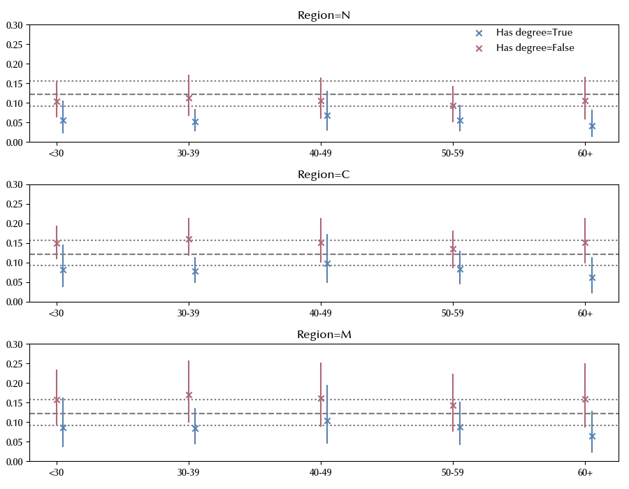
We can now inspect the effect of the education for each region and age group.
grp_list = list(range(5))
fig, ax = plt.subplots(nrows=3, figsize=(9, 7))
for i, region in enumerate(['N', 'C', 'M']):
    for deg in [1, 0]:
        ax[i].axhline(y=nat_proba[0], color='grey', ls='--')
        ax[i].axhline(y=nat_proba[1], color='grey', ls=':')
        ax[i].axhline(y=nat_proba[2], color='grey', ls=':')

        prob = np.array([get_proba(df_anag_deg[((df_anag_deg['Regione']==region) & (df_anag_deg['has_degree']==deg) & (df_anag_deg['Gruppo'] == grp))])
               for grp in grp_list]).T
        asymmetric_error = np.array(list(zip(np.array(prob[0])-np.array(prob[1]), np.array(prob[2])-np.array(prob[0])))).T
        ax[i].errorbar(np.array(grp_list)+0.05*deg, prob[0], yerr=asymmetric_error, ls='None')
        ax[i].scatter(np.array(grp_list)+0.05*deg, prob[0], label=f'Has degree={bool(deg)}', ls='None', marker='x')


    ax[i].set_ylim([0, 0.3])
    ax[i].set_title(f"Region={region}")

    legend = ax[0].legend(loc='upper right', bbox_to_anchor=(0.94, 1.05))
    legend.get_frame().set_alpha(0)
    ax[i].set_xticks([0, 1, 2, 3, 4])
    ax[i].set_xticklabels(['<30', '30-39', '40-49', '50-59', '60+'])
fig.tight_layout()
We can finally provide a national-level estimate for the target probability
nat_proba_raw = get_proba(df_n_by_group, col='y')

dt_mean = [nat_proba[0], nat_proba_raw[0]]
dt_low = [nat_proba[1], nat_proba_raw[1]]
dt_high = [nat_proba[2], nat_proba_raw[2]]

asymmetric_error = np.array(list(zip(np.array(dt_mean)-np.array(dt_low),
                                     np.array(dt_high)-np.array(dt_mean)))).T

fig, ax = plt.subplots(figsize=(3, 5))
ax.errorbar(np.arange(len(dt_mean)), dt_mean, yerr=asymmetric_error, ls='None', marker='x')
ax.set_xticks(np.arange(len(dt_mean)))
ax.set_xticklabels(['Post-stratified', 'Raw estimate'])
ax.set_ylim([0, 0.2])
ax.set_xlim([-0.5, 1.5])

The mean difference between the stratified estimate and the raw one is of the order of the 10%, and it’s of the same order of magnitude of the 90% CI, therefore the raw estimate is totally unreliable.
Conclusions
We discussed MRP, and we have seen how to implement it in Python in order to provide reliable estimates for surveys, especially when they are performed on a selected population.
Suggested readings
%load_ext watermark
%watermark -n -u -v -iv -w -p xarray,numpyro,jax,jaxlib
Python implementation: CPython
Python version : 3.12.4
IPython version : 8.24.0
xarray : 2024.5.0
numpyro: 0.15.0
jax : 0.4.28
jaxlib : 0.4.28
numpy : 1.26.4
pymc : 5.16.2
pandas : 2.2.2
seaborn : 0.13.2
matplotlib: 3.9.0
arviz : 0.18.0
Watermark: 2.4.3